project stories: picasso gallery at the hirshhorn museum

ARCHITECTURE STUDENT PROJECT

  • Fall 1996
  • B.Arch. Year 4 Semester 1
  • Design Project
  • Studio Critics: Prof. Don Wall, Prof. John Nastasi

Fast forwarding to 4th year design studio in late 1996. This was… a wild project, and a wild semester.
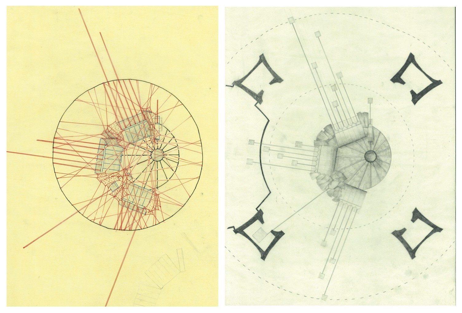
THE SITE

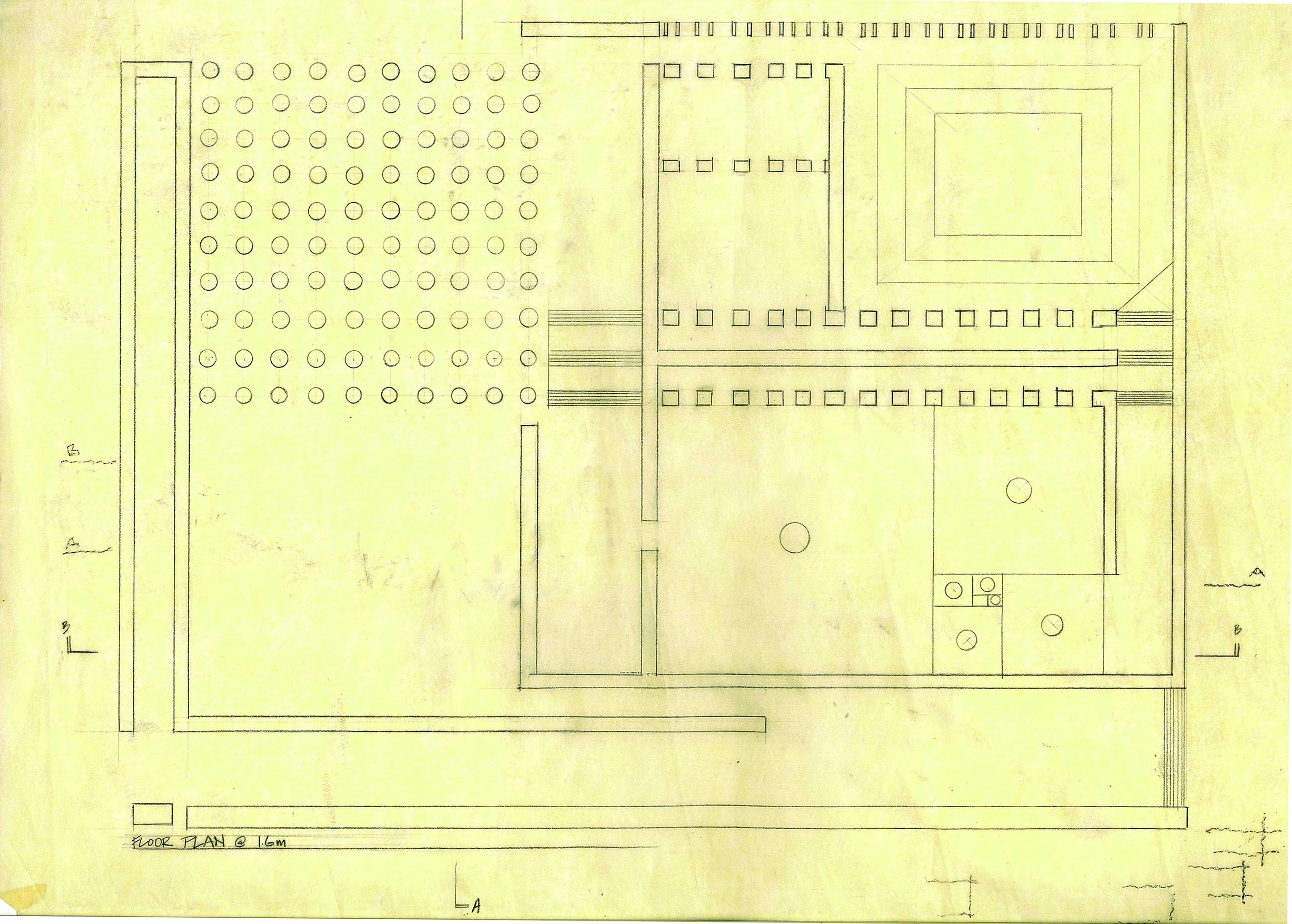
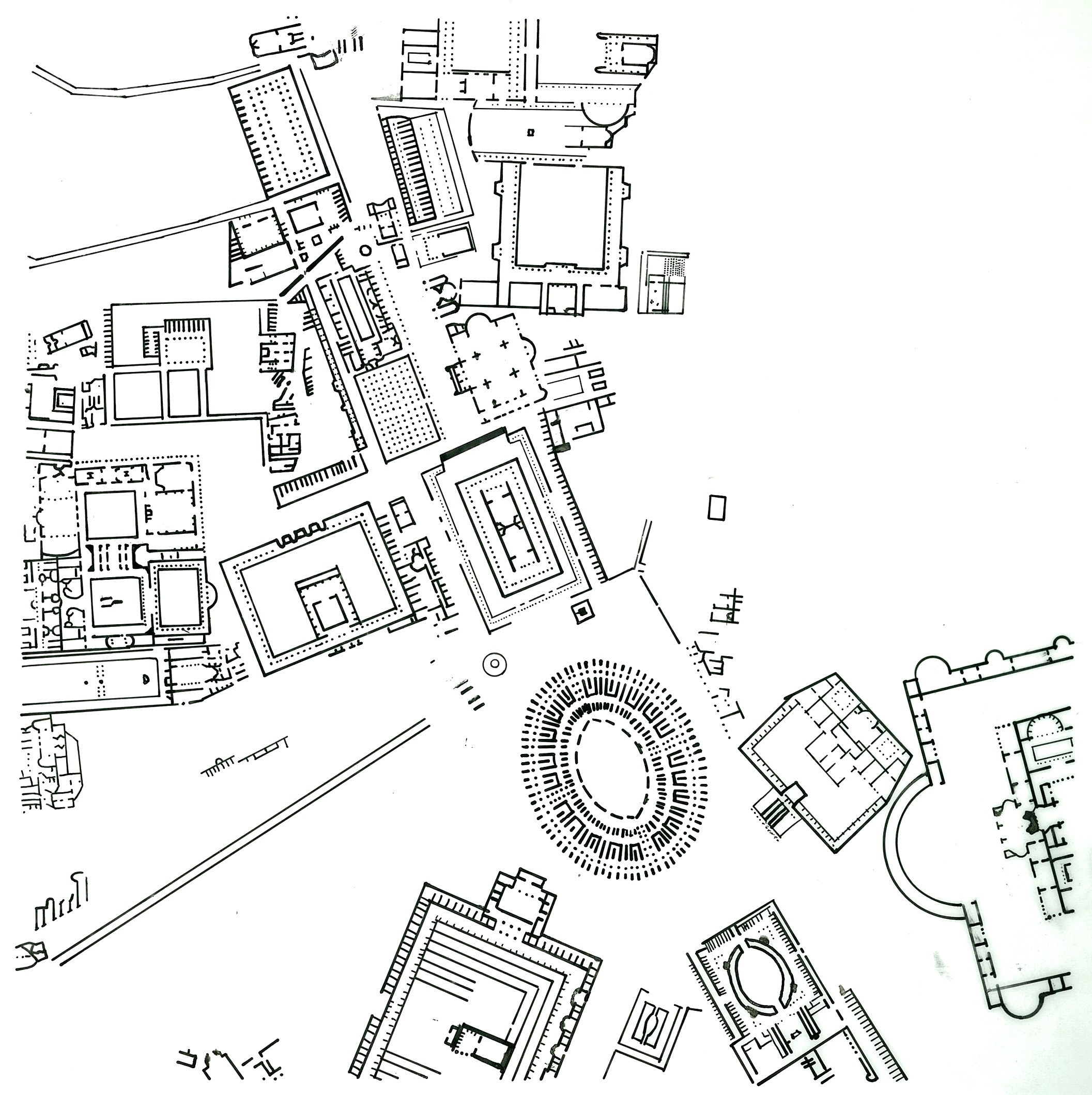
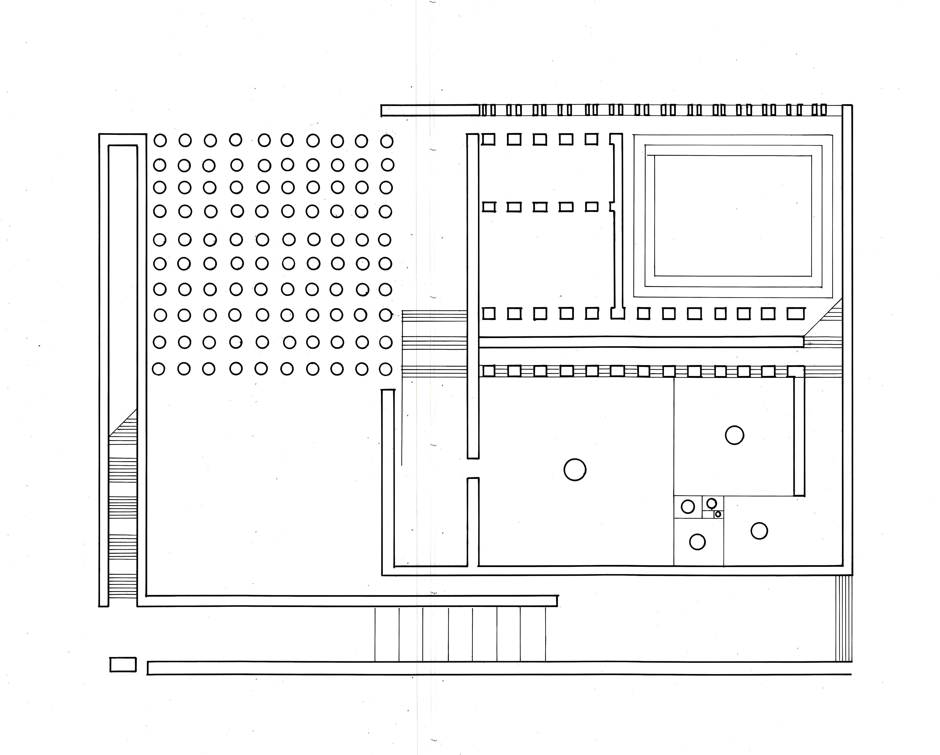
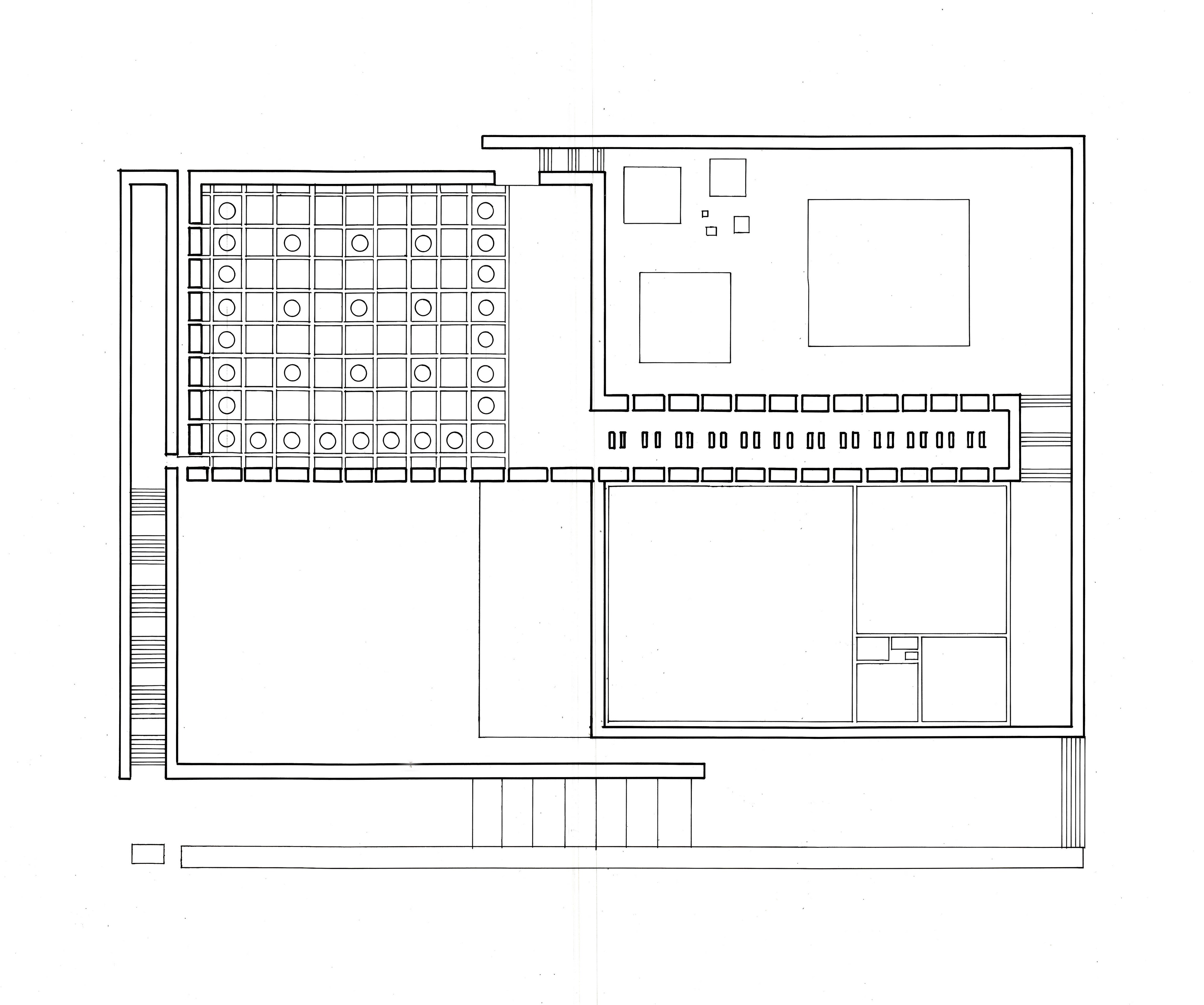
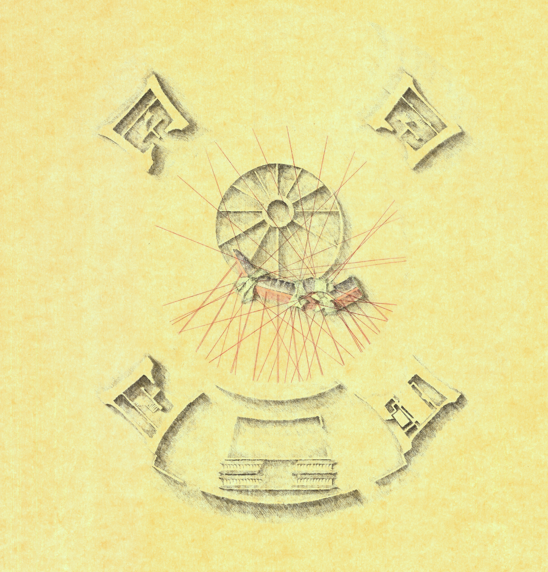
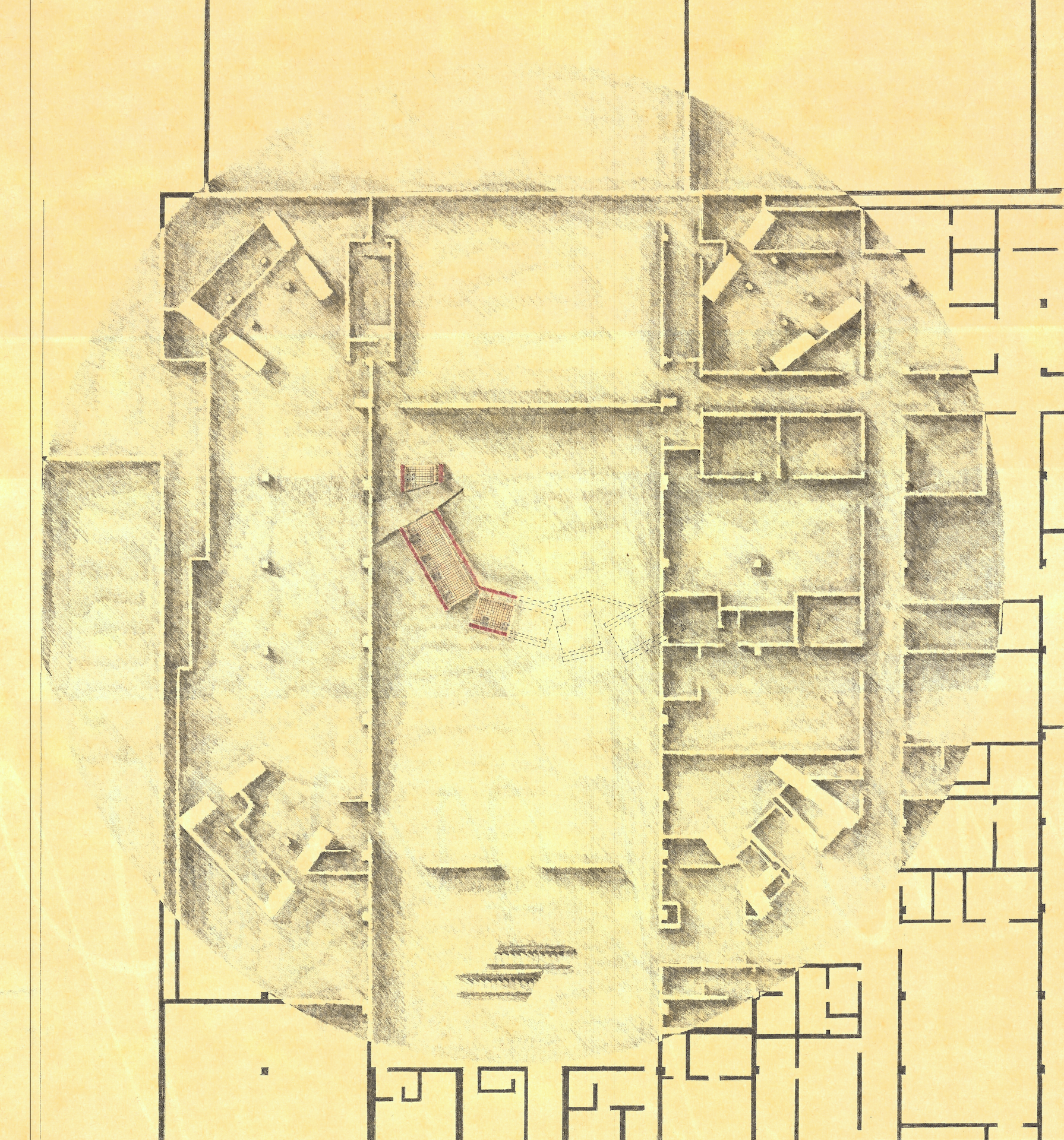
The Hirshhorn Museum, a 60,000sf Smithsonian modern art museum located on the Mall in Washington DC, designed by Gordon Bunshaft in the late 1960s. The museum is a brutalist donut of a building, an elevated concrete ring sitting on four massive pylons above a fountained courtyard plaza.

THE PROJECT

Design an addition to the museum to house a permanent collection of Pablo Picasso’s work (any subset of work that we chose). We could use any part of the museum interior or exterior for the addition. Prior to even starting design, we had to do extensive research on Picasso, his work, and our conceptual analysis thereof, to the extent of doing a proper research paper on it.

DESIGN INTENT

My two takeaways from the research on Picasso was that: a) he wasn’t in favour of ‘neutral’ white-walled art galleries, believing that the space should also reflect the nature of the art therein; and b) the style of Picasso’s work, particularly his portrait paintings, were heavily influenced by the woman he happened to be with at the time, covering 5 of his principal wives or lovers over the course of his long career.

DESIGN OBJECTIVE

To design 5 galleries, one for each of the 5 women, in which the art of those periods would be displayed, and the space for each would reflect Picasso’s emotional state when he was with those women. My critic Don Wall thought that 5 galleries would be more than I could manage in one semester, so they asked me to focus on just one. I reluctantly complied with his advice and I focused on The Olga Khoklova Gallery, based on his first wife who was a strict, overbearing Russian ballerina. But I did include in the architecture a suggestion of the second gallery, the one for Marie-Therèse Walter, his underage mistress whom he started seeing while still married to Olga.

DESIGN SOLUTION

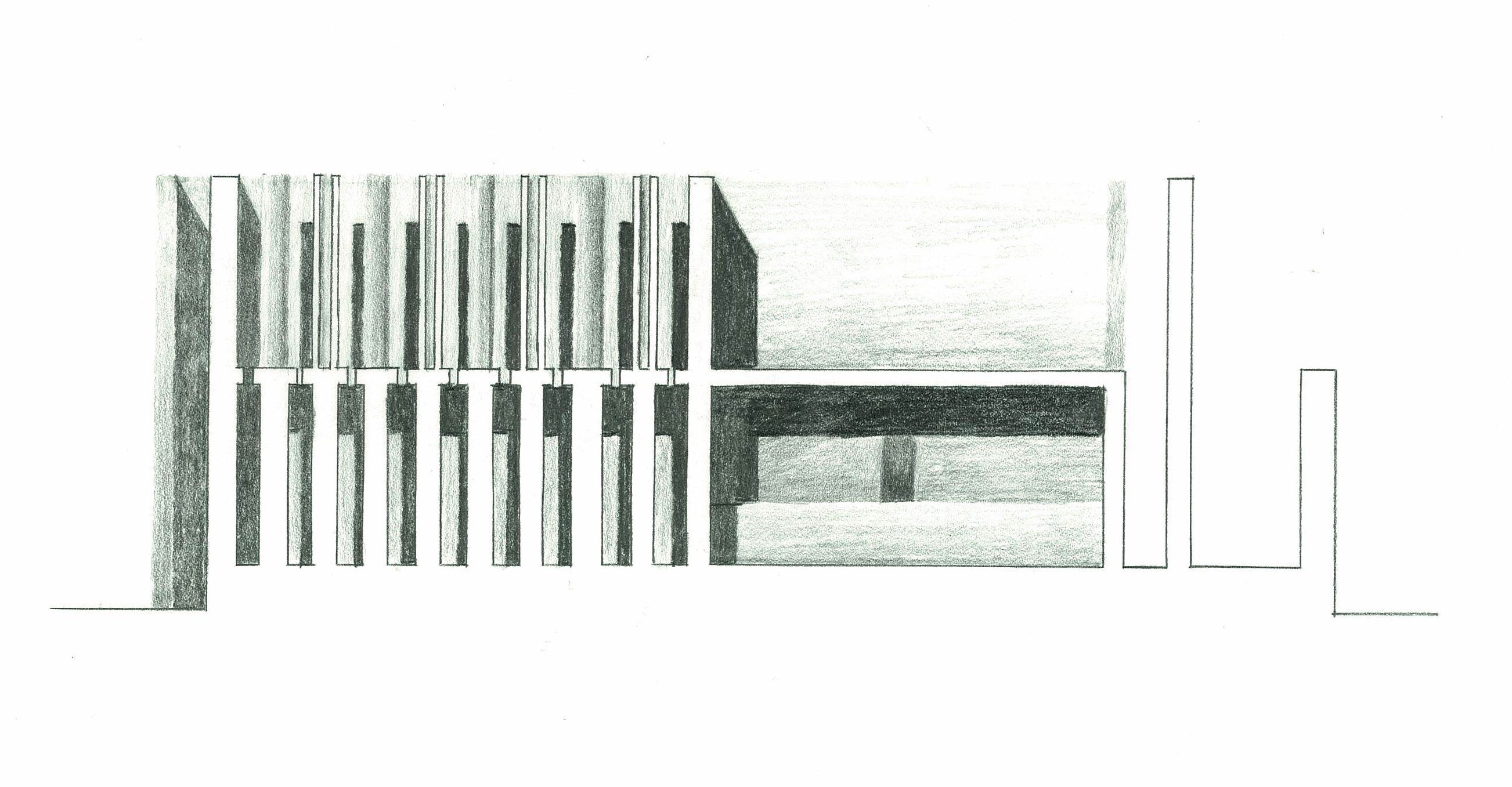
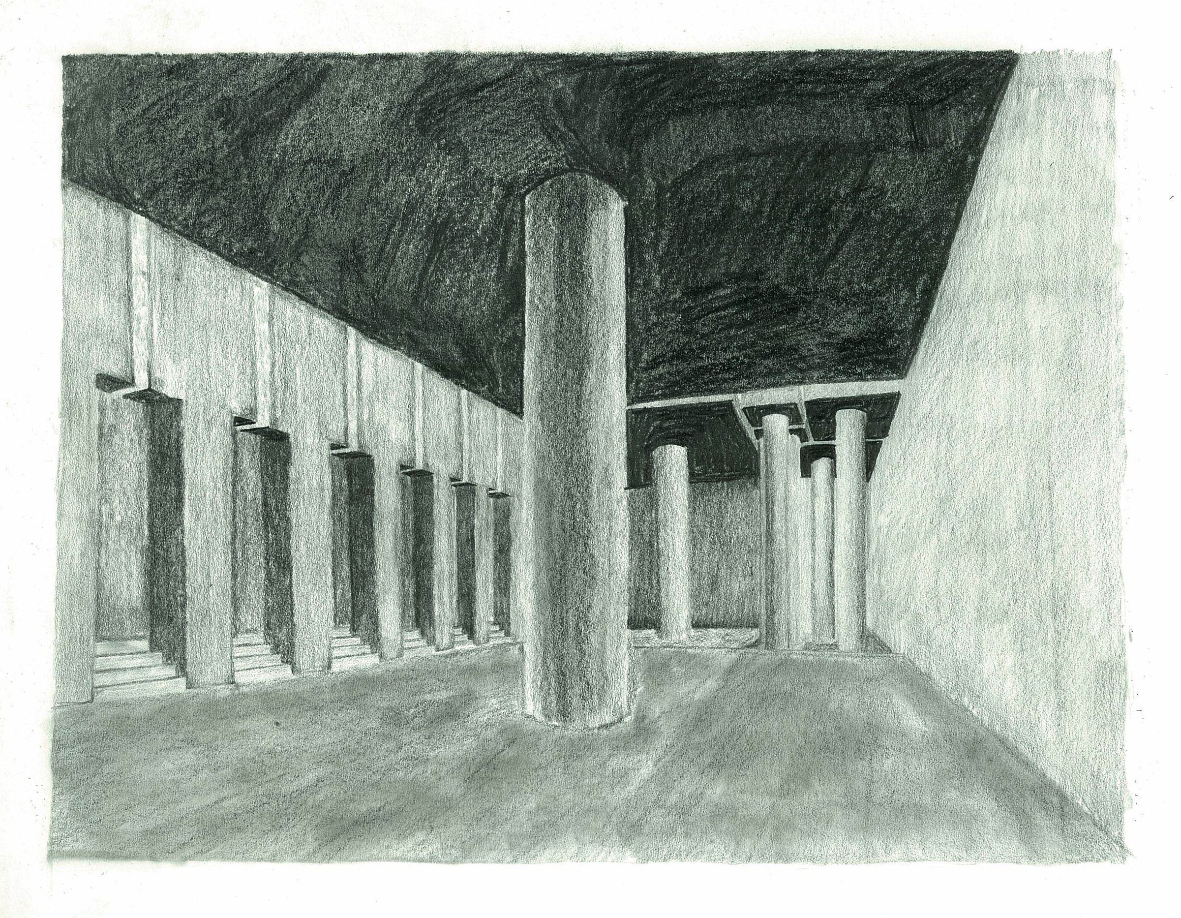
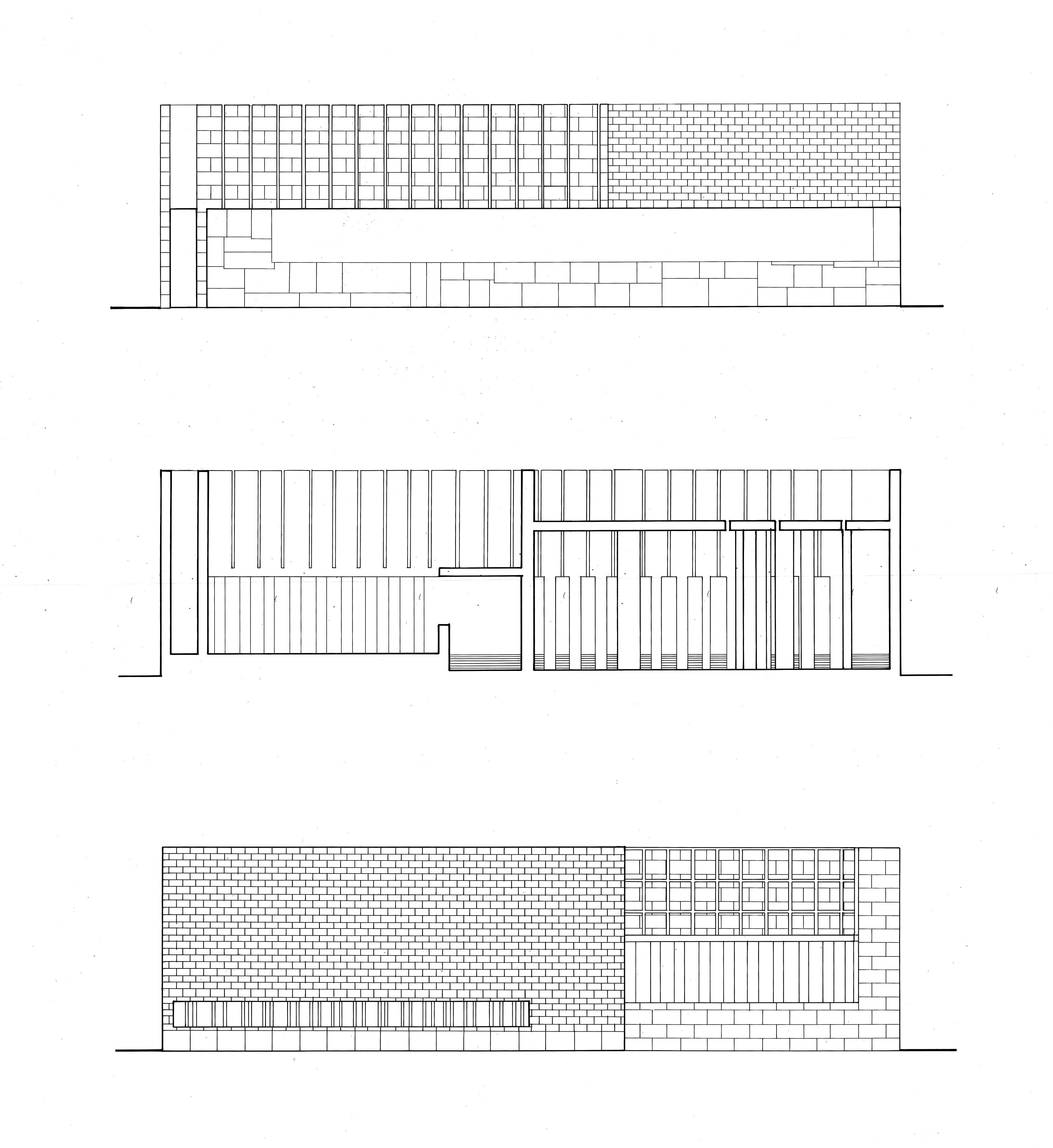
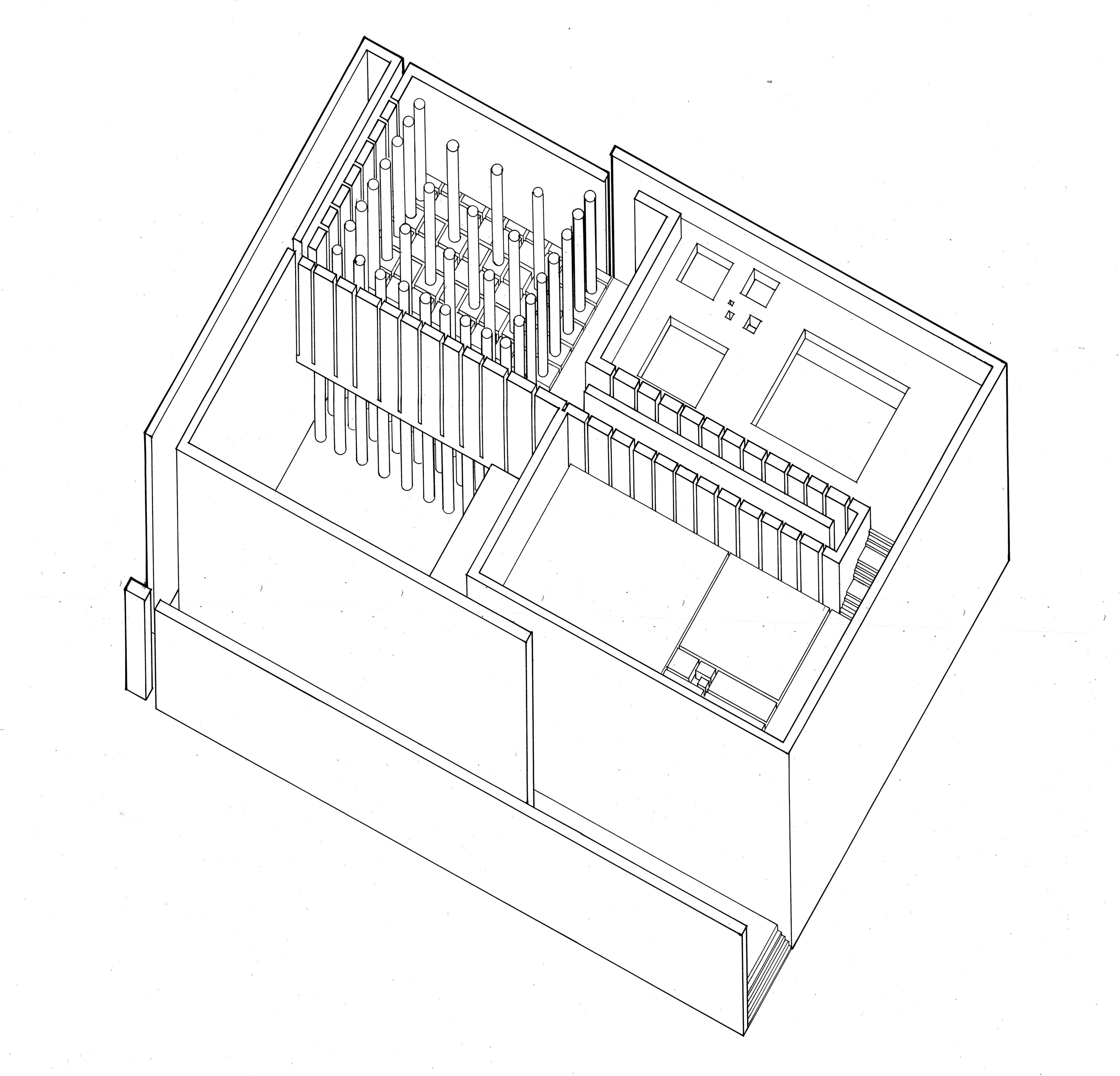
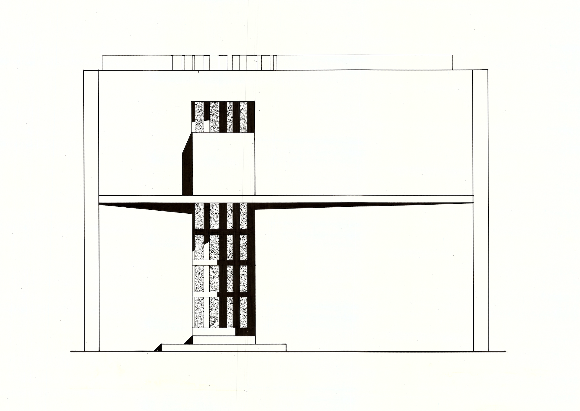
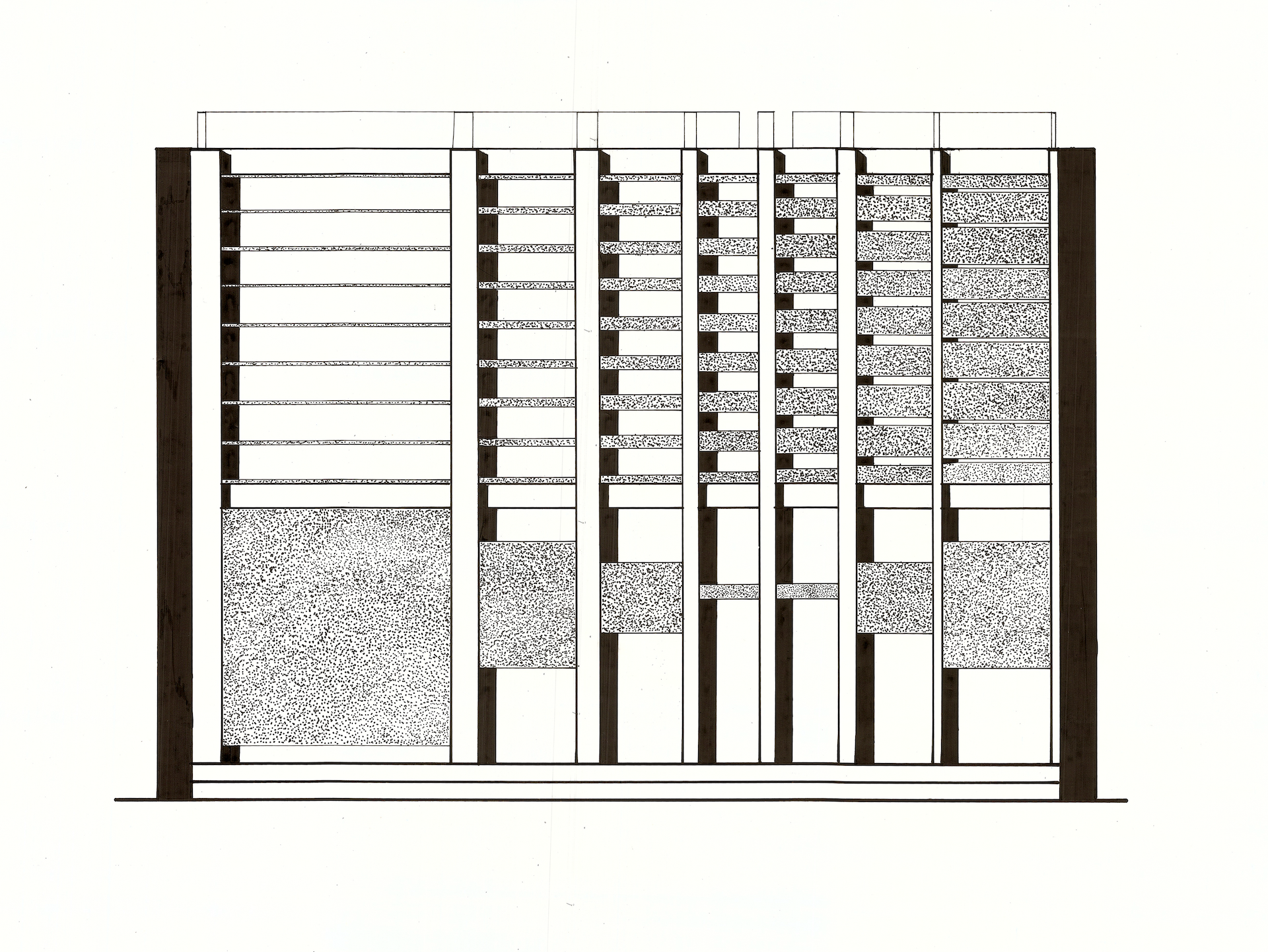
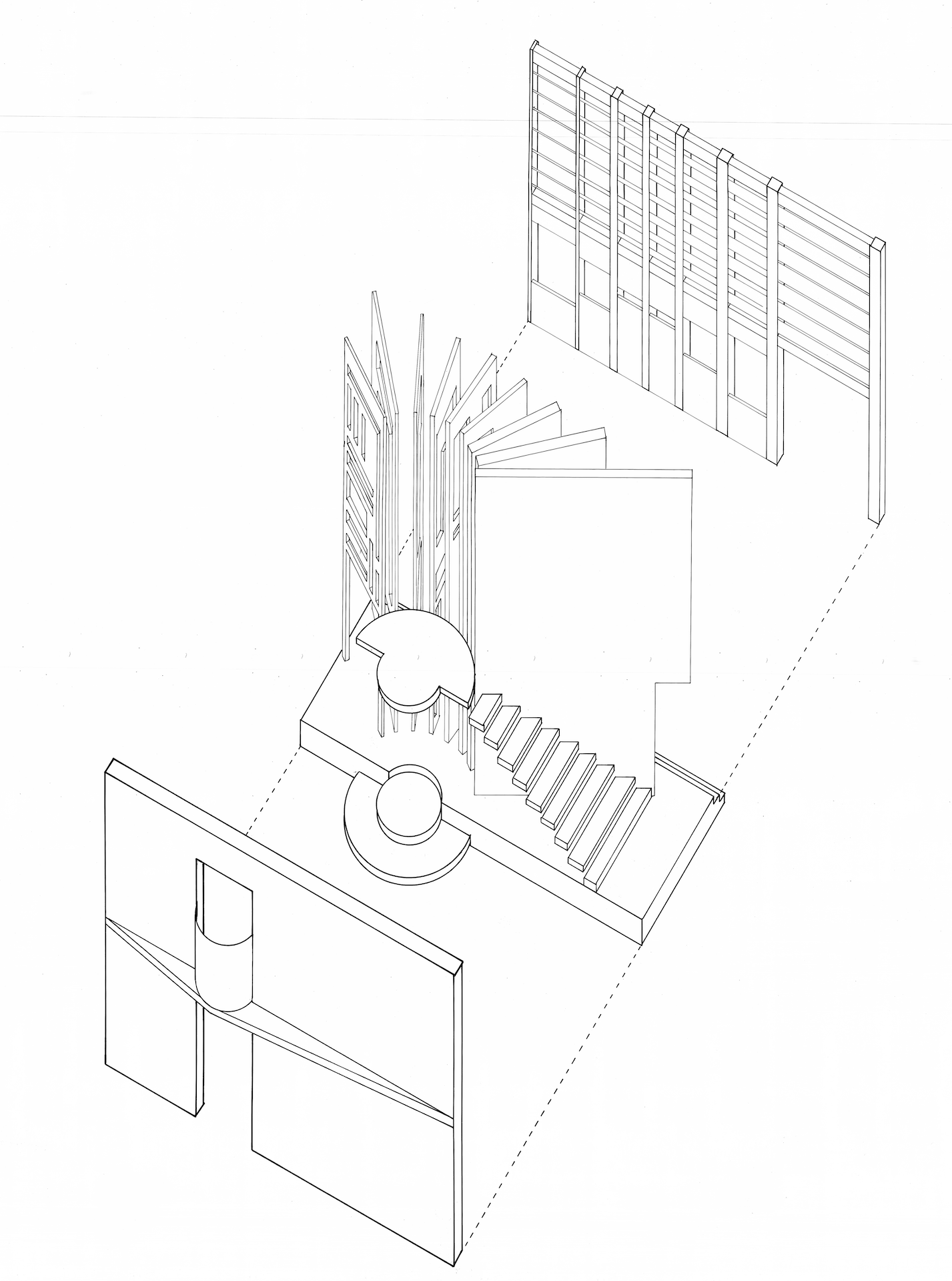
The final design was a linear segmented gallery that snaked up out of the storage basement, and emerged into the outdoor courtyard above, within the confines of the water fountain. The gallery was designed to make you feel uneasy, distracted, and overwhelmed, as Picasso felt when he was around Olga. The entire gallery is an unstable structure, held in place by cables attached to the building, and constantly moving. The display walls are heavy granite slabs tilted towards the viewer, to make them feel intimidated. The fountain water sprays continuously on the curved covering of the gallery, with the sound of droplets hitting the metal surface distracting the viewer. Basically, it’s a gallery designed to make one feel uncomfortable, which makes sense only because Picasso himself felt uncomfortable while painting these images, and the gallery should make you feel like the artist did, and perhaps even amplifying or intensifying the feeling. The gallery is also supported in part by heavy canvas balloons that fill the entire upper levels of the courtyard. This represents the ‘hint’ of Gallery #2, for Marie-Therèse, who made Picasso feel the opposite of Olga — nurtured, enveloped, and sometimes smothered. That gallery would make you feel like you were simultaneously floating and smothered by the huge balloons.

Image for post
Final design section, showing the existing drum-shaped Hirshhorn Museum with my intervention in the central courtyard.

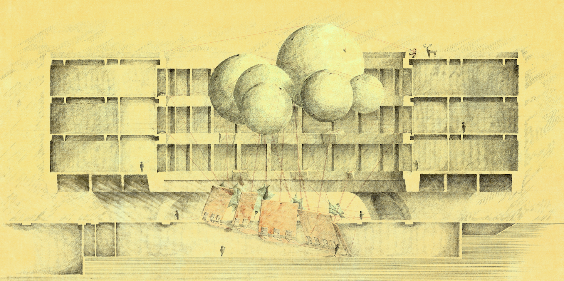
The section above was the centerpiece drawing of the presentation. This single drawing took me four days to make. The rendering is done in reverse style — I drew no lines to mark walls and floors, just left them white and rendered everything else. So whatever is white in the existing building is cut through.I rendered the section entirely in 9H graphite leads, which seems like an insane decision, but I did it for a reason. When you use softer leads, you can shade quicker, but you also lose your point very quickly, and there’s a noticeable difference in the stroke, which I wanted to avoid. It was an experiment which I probably wouldn’t do again, but I do tend to render with harder leads than normal, if not 9H exactly. (When I say four days, I mean four entire days, with just a few one-hour naps here and there. Probably close to 60 hours of actual working time.)

Image for post
Floor plan at plaza level. The central circle is the fountain, with my gallery emerging out of it from the basement below. Also shown are the pylons holding up the museum above, plus the entrance lobby to the museum proper.
Image for post
Floor plan at basement level. Most of what you see here is existing utilitarian space. My gallery is in the center, drawn in colour. The shaded area is intended to show the drum-shaped building above (the basement is not drum-shaped, and extends beyond the drum).

This was a very difficult yet rewarding project. Much of the difficulty came from approaching the design as a radical departure from traditional gallery design. Also the controversial theme… trying to express architecture as a reflection of two women, not necessarily to reflect on them as physical beings, but on how Picasso perceived them and how he felt with them, but most importantly how the style of his art manifested these feelings. The project is not a commentary on Picasso as a man or as a womanizer or objectifier of women (he arguably was), but I tried to see it as an architecture to display art that itself was a manifestation and extension of that art; a principle that could be applied to any art form or artist.

I felt that I was able to tap into some of this potential, thanks to the liberal critique of my teachers, who allowed me to see this as more of an intervention than an actual architecture. Work-wise, it was also a milestone for me, because up until this semester, I was never truly satisfied with my ability to complete a project, both in terms of design resolution and in creating drawings that were of a quality of presentation that I was happy to display.

Image for post
Studies of the gallery, and different ways it would be supported in place — a steel mesh floor with giant metal hinges attached to the tilted granite slab. The slab displays the work of the artist, but not on a vertical wall; instead it leans out over the viewer, meant to intimidate them.
Image for post
Studies of how the entire gallery might come up out of the basement level up to the courtyard above. I was looking at different ways the gallery might be segmented.
Image for post
More sectional studies, and an early floor plan at plaza level. Cables are holding the entire structure in place, albeit unstably.
Image for post
More versions of the floor plan at plaza level.
Image for post
Schematic ideas for the second (unfinished) gallery for Marie-Therèse

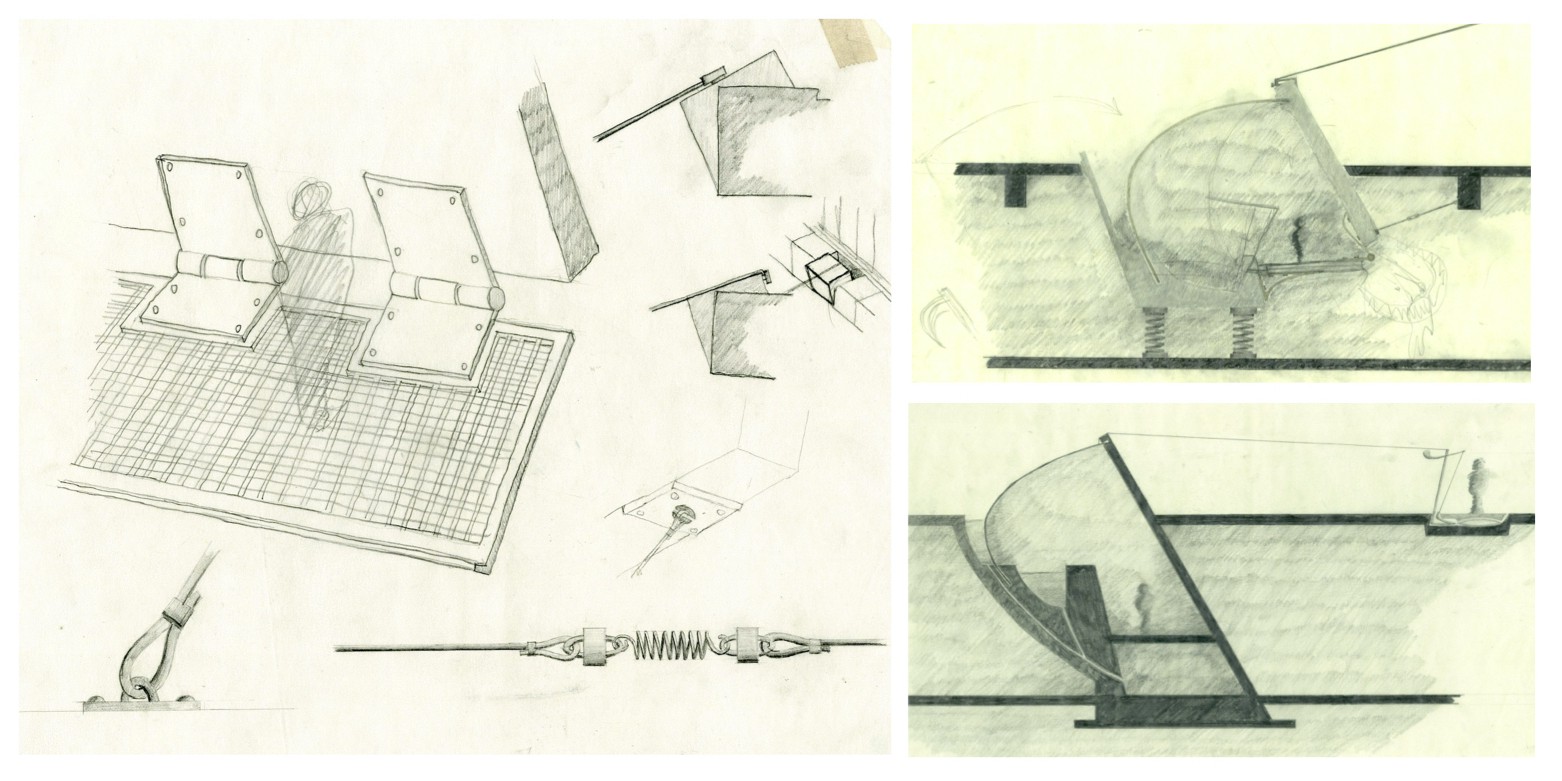
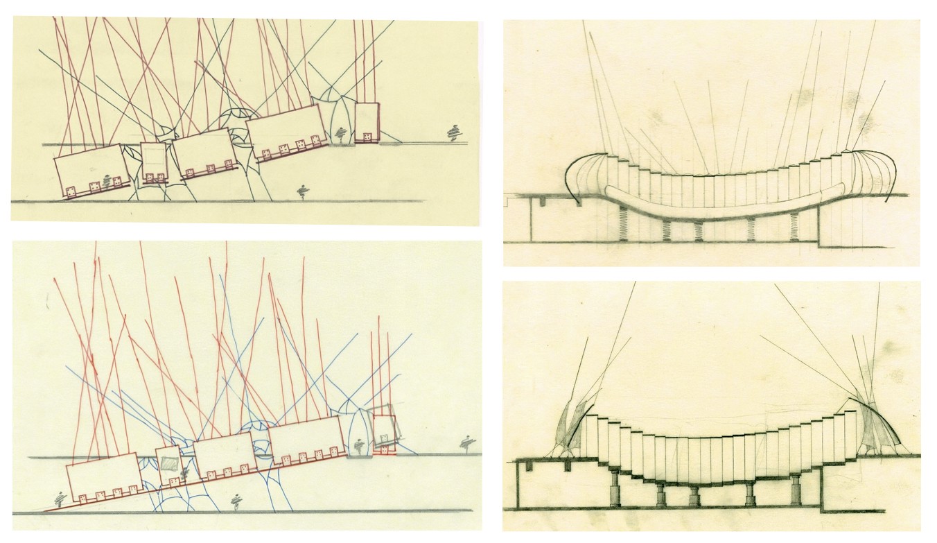
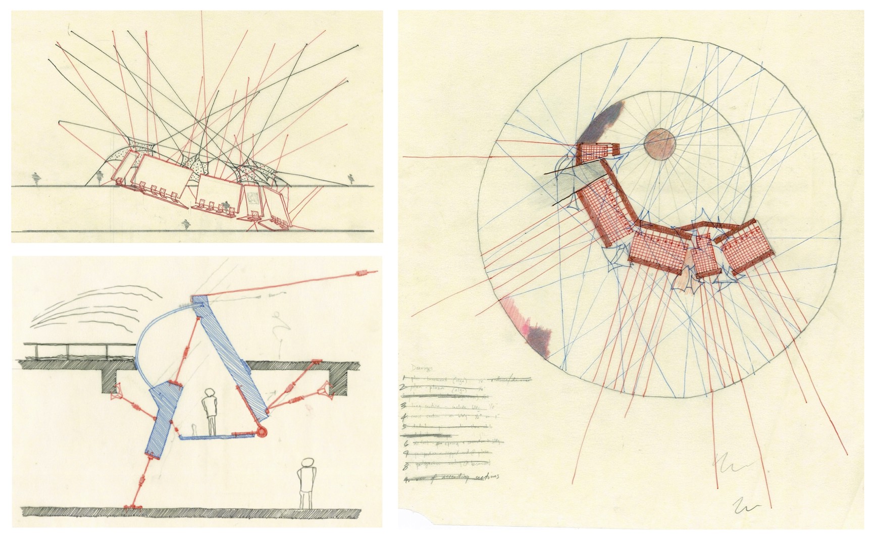
I tried to spend some time on how the second gallery would look — a series of balloons held aloft in the courtyard, with walkways going through and around them. You’d physically have to squeeze in between balloons to move around, a nod to feeling ‘smothered’ and womb-like. I eventually abandoned the idea of walkways and support columns, and just left the balloons as a ‘hint’ of what the second gallery might look like. The balloons also hold the lower gallery in place.

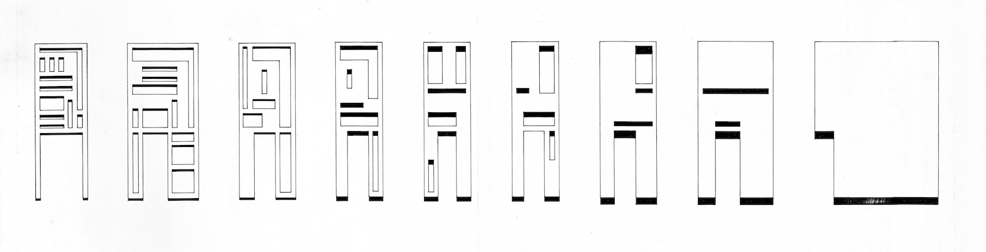
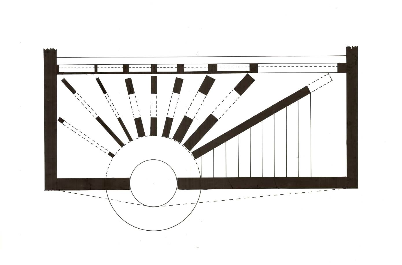
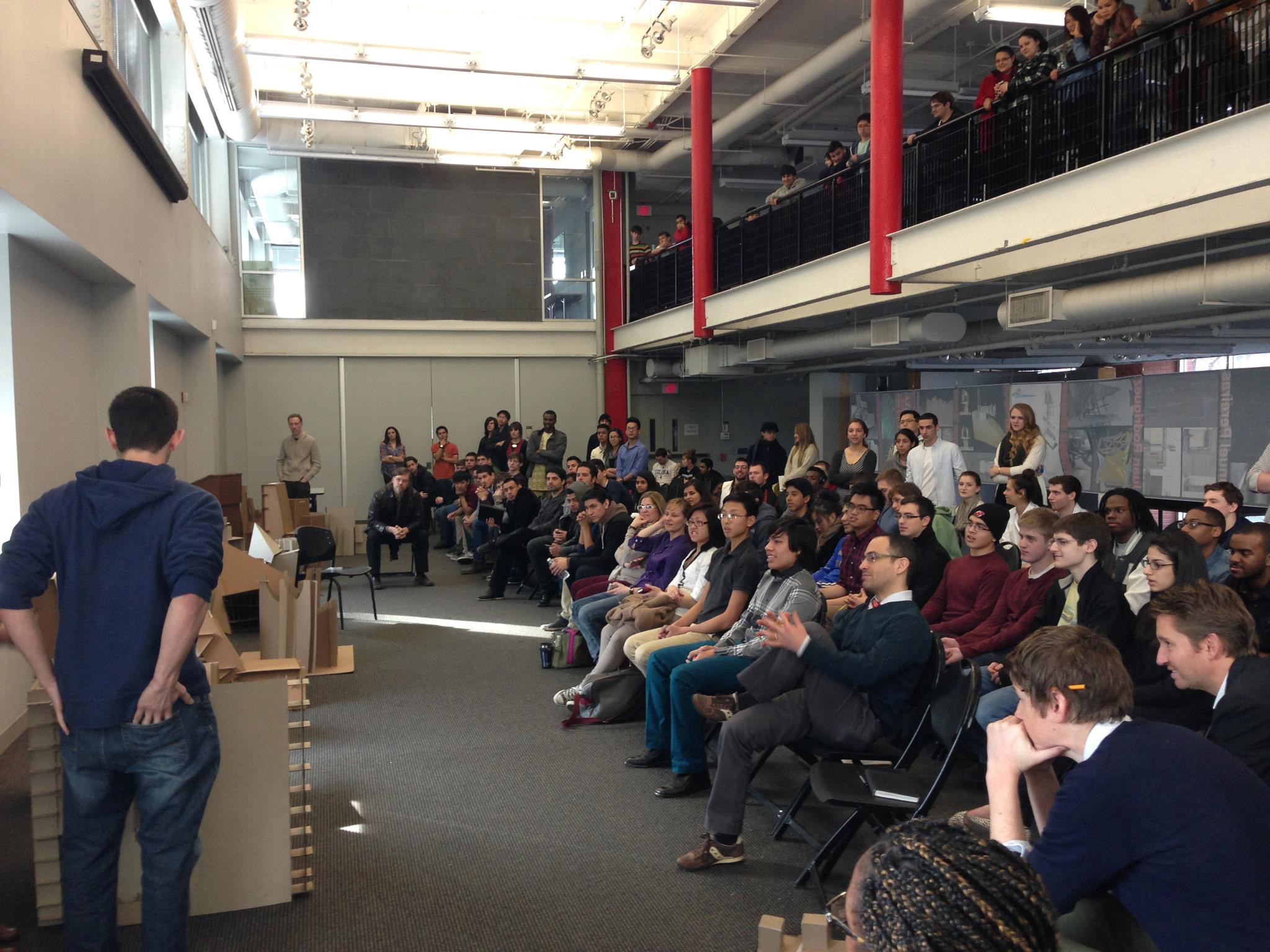
I worked extremely hard on this project, and I think the drawings show it, which is why I’ve uploaded many study and progress drawings to show how I got to the end. I’m fairly proud of the rigour and attention to detail that I put into this. Of course, I do wish I could’ve done even more, in particular to able to do the whole set of 5 galleries. I’m also proud of the quality of drawings, which I felt was at my highest point in my education thus far. I really tried to give myself enough time to make good drawings, and in fact, I told my professor (later my boss) that I was going to “stop designing” two weeks before the deadline, no matter how unresolved it was, so that for once I could have a decent presentation. He took that statement in his customary sardonic fashion. But I stuck to it, and I needed to. One of the final drawings took me four entire days to draw… just that one drawing. But I did finish my presentation on time, and spent much of the night before our project exhibition to set up the display exactly the way I wanted to, using a forest of cables tied to many fixed points in the exhibition space which held my drawings and model suspended in mid-air, and also making it near impossible (and uncomfortable, mind you) to get a good look at the drawings themselves. The Dean visited our exhibition and made a comment about how the display and the project content matched better than he’d seen any other project. (One of the rare moments that I felt pretty grateful to our Dean, to be honest.)

project stories: the danteum

ARCHITECTURE STUDENT PROJECT

  • Summer 1994
  • B.Arch. Year 1, Semester 2
  • Historical Architecture Documentation
  • Studio Critic: Prof. Craig Konyk

Since there was a group of 8 of us who had started architecture in the middle of the academic year (we had all transferred in from other places), the department created a bespoke summer design studio just for us so that we could catch up with the rest of the first year students. It was was pretty special to have such a small studio (usually sections were 15–18), although we didn’t realise it at the time, but we took full advantage of it.

First day of the class we were introduced to our first assignment — not design, but graphics and analysis. Drawing, decoding, and analysing an existing (unbuilt) building, which was the Danteum, designed by Giuseppe Terragni. I won’t get too much into the building here, but in 1938 Terragni was commissioned by the fascist Mussolini government to design a monument to Dante Alighieri, the author of The Divine Comedy. The building is essentially an architectural manifestation of the legendary poem itself. The site was right in the middle of the Forum of Rome, along with many other monuments from antiquity. Because of the onset of WW2, it never got built.

Prof. Konyk introduced us to the building and gave us a few photocopied pages which showed the architectural drawings, barely legible. The first task for the 8 of us was to sit together and make architectural sense of this building, going from the poorly reproduced plans we already had. We didn’t have the internet in those days, so a couple of trips to the library, and some serious puzzling out finally got us to a comfortable understanding of what was going on in this complicated building. The building is very complex, with no simple division of floors or rooms. It’s also highly symbolic and representational (e.g. 100 hypostyle columns to represent the 100 cantos of the poem.)

From a classwork perspective, each of us was expected to draw initial pencil drawings on tracing paper by the next morning. 2 plans, 2 sections, 4 elevations, site map, axonometric, perspective, and a ‘concept’ drawing. All in one day. And we actually did it. Prof. Konyk told us much later that he never expected we would all complete the work. But that wasn’t enough. After a groggy morning spent analysing and critiquing the drawings, we had to redo them formally on vellum. After another day, we re-drew them *again* using ink and mylar. These weren’t tiny sheets, either… each sheet was about 24×36. Each of us worked through most of those first 3 nights without much sleep.

I show these drawings to my students and tell them this story to let them them know that what we ask of them is no more than what was asked of us when we were studying. Architects, especially teachers, love to tell stories like this about how much they worked their asses off in the “old days” when their teachers were taskmasters. It’s probably fair to say that most students today wouldn’t do all that work without at least questioning it. But now as a teacher, I’m also not sure that’s reason enough to perpetuate such intense labour. Anyway, that’s a topic for another day.

Another thing I think about nowadays is how much easier it would have been to do this assignment today, not from a drawing perspective but from a decoding perspective. We had very little back then in terms of resources to help us understand the building — history, concept, process, spatial configuration. Now, you can read about it instantly and download the drawings and 3D models and walkthroughs in a second.

Image for post
One of the initial pencil-on-trace drawings (first day’s work assignment). Note the teacher’s marks in the lower right corner, showing us how to draw the end of a wall, and have the lines overlap.
Image for post
Rendered pencil cross-section. My rendering techniques have improved since then.
Image for post
Rendered perspective of one of the ‘rooms’. In this case, I chose the room representing the Inferno portion Dante’s poem. This room has 7 columns and 7 floor slabs and 7 ceiling slabs (representing 7 levels of hell) descending in a spiral according to the golden ratio.
Image for post
Site plan of the Forum in Rome, with the Colisseum figuring prominently. See if you can find the Danteum drawn in there somewhere.
Image for post
Lower level floor plan showing the entrance court, hypostyle hall with 100 columns (1 for each ‘canto’ of the poem), the Inferno room.
Image for post
Upper level floor plan showing the Purgatorio room and the open-to-sky Paradisio room, with 33 glass columns (1 for each canto in that portion of the poem).
Image for post
Two exterior elevations (long sides) and one long section between. This was a major exercise in line weights, the exacting detail of which is not entirely visible here. The masonry hatch pattern was drawn on the reverse side of the transparent mylar in order to make it seem even lighter.
Image for post
Axonometric view showing the roofs of the Inferno and Purgatorio, and the open Paradisio room.

project stories: a wall with two faces

Architecture Student Project

  • Spring 1994
  • B.Arch. Year 1 Semester 1
  • Design Project
  • Studio Critic: Prof. Joy Seigel

My very first semester in architecture school in 1994. This was the final project for B.Arch. Year 1, Semester 1 (Design Critic: Joy Seigel). The project was titled “A Wall with Two Faces” and the idea was to design a conceptual wall between the city and the garden, representing the link/divide between man/technology and nature/monumentality.

In order to inject transparency (i.e., give the observer a hint of what the “other side” represented), I flipped the two faces of the wall so that the facade representing technology faced the garden, and the facade representing monumentality faced the city street.

The wall’s dimensions were 25ft wide x 20ft tall, and the “wall” was actually a space 8ft deep. This was where the transition between the city and garden would happen.

I got an A for this class, and the jury appreciated my work. I do remember one of them saying that I had too many ideas in this project and I should save them up for the future. At the time, I resented the comment a bit, thinking “When the hell am I going to do another Wall with Two Faces project?” But he was right. Looking back, I think the project should have been simpler and not so burdened with complicated, sometimes overlapping concepts. But I’m still proud of the work I did for it.

The drawings are ink on mylar with Rapidograph technical pens, and these were the final presentation drawings. I had a basswood model, but that was lost/destroyed long ago.

Image for post
The city-facing side of the wall, representing the monumental aspect of nature. Simple, unarticulated, and a high vantage point.
Image for post
The garden-facing aspect of the wall, representing the mathematical rigour and regularity of technology and urbanity, with variable vantage points
Image for post
The interior panels between the facade, which the occupant must walk through, in decreasing levels of articulation.
Image for post
The plan. Lower part faces the city street. You enter from the circular steps, turn left, and then walk through the openings of the panels. Before the last panel, you choose to exit out into the garden or continue through the panel and go up the steps to the balcony.
Image for post
Exploded isometric view. City-facing side is below, garden-facing is above, with the transition space in between. One walks through the series of panels, and can either walk into the garden, or continue and walk upstairs to the vantage point (balcony).

summertime for design students

TIPS FOR DESIGN STUDENTS TO STAY MENTALLY ENGAGED, ACTIVE, AND CREATIVE DURING SUMMER VACATION

[Note: This is an essay I wrote and have been sending to my students every year. Obviously this year, things are a bit different. The pandemic and subsequent lockdowns are going to limit some of the activities I’ve listed here. But on the other hand, they will give you ample time to do some of the other activities. So adjust accordingly.]

A lot of my students complain about being bored during the summer holidays. On the one hand, it’s surprising how quickly you start being bored. On the other hand, I can understand how a full year of design school gets your neurons firing with intense frequency, and sitting at home or hanging out at the coffee shop is just not doing it for you anymore. You’ve gotten used to thinking at a high level and being creative. So I’ve put together a few suggestions to relax during the holidays and still exercise that brain muscle of yours. Like all muscles, if you don’t exercise it, it will be that much harder to get back in shape.

I don’t expect all of you to follow all of these suggestions, but give them a try. Without a doubt, have fun… have loads of fun. Anyway, here are some ideas that help fight off boredom and will also make you a better designer.

  • Read! You can read books about design or architecture, but just read something! Fiction, non-fiction, comic books, newspapers, magazines, online articles, whatever. Try audio books if you have a hard time reading. At the end of this essay, I’ve listed some books that might be interesting for architecture and design student
  • Practice drawing. Go outside and observe the macro world — go to malls, train stations, airports, and other public spaces and draw what you see. If you’re at home, draw what you see at home or outside your window. Practice rendering techniques and drawing with unfamiliar media. Learn to get better at free-hand skills. Develop your ability to draw what you imagine — visualise things in your mind and draw them.
  • Go to public places and simply observe human behaviour. Watch how people interact with spaces and the objects within them. Ask them questions and inquire why they’re doing what they’re doing and whether they’re even conscious of it. Take pictures! One of my favourite idle activities is to sit at an airport or station and invent background stories for people that I observe.
  • Learn a new software (or simply get better at what you already know) like Autocad, Sketchup, Revit, Rhino, Grasshopper, Maya, Vray, 3DS Max, Photoshop, Illustrator, InDesign, Final Cut Pro, AfterEffects, etc. YouTube has become a great resource for this. Learn to code, design a website, or Flash, HTML, CSS, and Javascript. Learn how to do better presentations beyond simple Powerpoint.
  • Learn a new form of creative expression, like filmmaking or cartooning. Explore different media, e.g. watercolour, clay sculpture, mosaic, photography, etc. Learn a musical instrument or explore a musical genre that you’ve never listened to before. Act in a play, or write one.
  • Design a new game. It could be a board game, card game, mobile app, or even a new sport.
  • Practice writing and composition. Start a blog or write reflective essays. Write poems.
  • Design (or refine) your portfolio. Document your work and think of a way to present it, both as a hard-copy and digital. Figure out how to let it expand as your body of work grows. Make sure it’s a good representation of “you”. But try to keep it simple and resist the temptation to include everything. Sometimes it’s worth asking someone to help you edit.
  • Browse random Wikipedia articles or use websites like StumbleUpon or HowThingsWork to discover new things. There are many YouTube channels which explain how things work and how things are made.
  • Explore design workshops or seminars (or webinars) that are happening in your town (or nearby). Go to museums and galleries and be aware of new exhibitions.
  • Learn a language, or learn about a new culture, craft or art form. Travel to somewhere you’ve never been, even it’s a neighbourhood in your own city. Meet an artist, craftsman, artisan, performer, or designer and observe how they work.
  • Engage in some social work or volunteer activity. Join an NGO and find out ways that you can perhaps help them with their design objectives (e.g. designing posters, brochures, or newsletters for them).
  • Try to get a job at a design firm as an intern. Offer to help them in any way you can (but insist on getting paid in some way, even if only to cover your expenses).
  • Watch movies, preferably about art, design or architecture, but watch stuff that’s intellectually stimulating. Sure, there’s nothing wrong with the occasional mindless summer action blockbuster, but balance it out with some ‘other’ stuff. Again, I’m including a list of movies that have some relevance to design and architecture.
  • Watch TV and OTT shows. Life is not all about bad American sitcoms. Watch quality TV shows and limited series. Subscribe to a streaming service if you don’t have it already and dig deep into their library for shows that you may have never heard of. Look for good documentaries.
  • Listent to Podcasts. There are hundreds if not thousands of podcasts on incredibly interesting topics — some specific, some general. If you have difficulty reading, then podcasts is another way you can learn.
  • Above all, don’t let boredom be an excuse for wasting time. Fill your time with interesting stuff. Catch up on sleep (because you know you won’t be getting much when school starts again) and break up your day into fragments of activities so you don’t get bored of doing the same thing.

SUGGESTED READINGS

Books and articles that feature architecture and design

  • Architecture: Form, Space and Order by Francis DK Ching
  • A Tractate on Japanese Aesthetics by Donald Richie
  • The Death and Life of Great American Cities by Jane Jacobs
  • The Wright Space: Pattern and Meaning in Frank Lloyd Wright’s Houses by Grant Hildebrand
  • Invisible Cities by Italo Calvino
  • Ways of Seeing by John Berger
  • The Soul of a Tree by George Nakashima
  • Drawing on the Right Side of the Brain by Betty Edwards
  • Great Streets by Allan Jacobs
  • The Poetics of Space by Gaston Bachelard
  • Principles of Art History by Heinrich Wölfflin
  • Flatland: A Romance of Many Dimensions by Edwin A Abbott
  • Why Buildings Stand Up by Mario Salvadori
  • Why Buildings Fall Down by Mario Salvadori
  • Zen and the Art of Motorcycle Maintenance by Robert Pirsig
  • The Tibetan Book of the Dead by Sambhav Sambhav
  • Learning from Las Vegas by Robert Venturi and Denise Scott Brown
  • Brave New World by Aldous Huxley
  • 1984 by George Orwell
  • Red Mars by Kim Stanley Robinson
  • Freakonomics: The Hidden Side of Everything by Steven Levitt & Stephen Dubner
  • Mother Pious Lady: Making Sense of Everyday India by Santosh Desai
  • The Enlightened Cyclist by The Bike Snob
  • Rendezvous with Rama by Arthur C. Clarke
  • How to Read Towns and Cities: A Crash Course in Urban Architecture by Jonathan Glancey
  • The World Without Us by Alan Weisman
  • How to Live in a Flat by W. Heath Robinson and KR Browne

SUGGESTED MOVIES

Films that feature architecture and design

  • Metropolis (1927, dir. Fritz Lang)
  • Gattaca (1997, dir. Andrew Niccol)
  • North by Northwest (1959, dir. Alfred Hitchcock)
  • Rear Window (1954, dir. Alfred Hitchcock)
  • 12 Monkeys (1995, dir. Terry Gilliam)
  • Ran (1985, dir. Akira Kurosawa)
  • Rashomon (1950, dir. Akira Kurosawa)
  • Seven Samurai (1954, dir. Akira Kurosawa)
  • Moon (2009, dir. Duncan Jones)
  • The Fifth Element (1997, dir. Luc Besson)
  • Dark City (1998, dir. Alex Proyas)
  • My Architect (2003, dir. Nathaniel Kahn)
  • Parasite (2019)
  • Blade Runner (1982, dir. Ridley Scott)
  • Blade Runner 2049 (2017, dir. Denis Villeneuve)
  • The Grand Budapest Hotel (2014, dir. Wes Anderson)
  • 2001: A Space Odyssey (1968, dir. Stanley Kubrick)
  • Brazil (1985, dir. Terry Gilliam)
  • The Hudsucker Proxy (1994, dir. Joel/Ethan Coen)
  • Koyaanisqaatsi (1982, dir. Godfrey Reggio)
  • Powaqqatsi (1988, dir. Godfrey Reggio)
  • Life as a House (2001, dir. Irwin Winkler)
  • Helvetica (2007, dir. Gary Hustwit)
  • The Five Obstructions (2003, Jorgen Leth & Lars von Trier)
  • Art and Copy (2009, dir. Doug Pray)
  • Handmade Nation (2009, dir. Faythe Levine)
  • Rivers and Tides: Andy Goldsworthy Working with Time (2001, dir. Thomas Riedelsheimer)
  • Wal-Mart: The High Cost of Low Price (2005, dir. Robert Greenwald)
  • Wall-E (2008, dir. Andrew Stanton)
  • 9 (2009, dir. Shane Acker)
  • Logan’s Run (1976, dir. Michael Anderson)
  • City of Ember (2008, dir. Gil Kenan)
  • The Matrix (1999, dir. The Wachowskis)
  • Total Recall (1990, dir. Paul Verhoeven)

dear design students: here are ten tips for your upcoming jury

You’re welcome. Sincerely, Your Design Faculty

Image for post

For design students, juries are often a source of anxiety and stress, but ideally they shouldn’t be. Juries are primarily about design critique and they work best when they’re open, honest, impersonal, and transparent. However, this openness can also mean that jury feedback can be subjective, contradictory, and confusing. Add this to the anxiety of presenting your work to ‘experts’ and ‘professionals’ after many months of hard work and naturally students find juries a cause for distress. And I admit that we as design teachers often give mixed messages about how seriously you should approach juries:

Message A: “Juries are important; take them seriously. Don’t embarrass us in front of industry professionals!”

Message B: “Juries are not that important; don’t worry, relax. Don’t take it personally.”

These messages aren’t necessarily contradictory, they simply need to be balanced. So take the jury seriously if you want to get feedback, but don’t take it so seriously that you get nervous and can’t represent your work in a good light. But do remember: It’s only a jury, after all…. it’s not a trial, or a judgement, or a punishment. It’s simply a critique on your work by professionals and academics who are not intimately familiar with your project, or with you. I think many students have the wrong impression about juries and put a lot of pressure on themselves which itself causes the distress that one is fearing and in turn causes the jury to go ‘bad’.

Yes, you should take juries seriously. Yes, you should speak maturely, dress appropriately, and be well groomed and bathed. You should make a good impression not just for yourself but your institution. To help with this, I’d like to share ten general tips for a healthy, productive, and stress-free jury.

1. BE PREPARED

Double check your sheets, slides, videos, renders, animations, prototypes, models. Make sure you have everything. This doesn’t mean that you’ll present everything, but be prepared to show any work that jurors may want to see. Keep in handy, and ready to find in an instant, either physically or digitally. Give yourself enough time to check. Enlist your family to help you. Be ready when it’s your turn, and don’t make the jury wait for you. Arrive on time and set up on time. If you’re presenting digitally, check all A/V connections and make sure all your tech gadgets work properly. If you’re posting physical sheets on a wall panel, bring plenty of pins! Rehearse your presentation beforehand. Keep notes if you need them, and present your work in the form of a story or narrative. Many of you go through your project like this: “First you enter from here, then you go here, then there’s a desk, then there’s a table…”. Instead, talk about your design process. Start with your design problem, your case studies, and your analysis. Describe what you learned from them, and what you chose to bring into your design brief and concept. Then explain how that concept manifested in your design development and detailing. Use the right design vocabulary which was taught to you. Avoid the words “basically” and “just” and “like” and “kind of” and “sort of” and “ummm”.

2. BE RESTED

Don’t make the mistake of staying up all night before your jury. Get a good night’s sleep. Eat a healthy breakfast. Be clean and fresh and alert. Dress appropriately; be cognisant of your appearance — whether it’s about clothes, makeup, headgear, or accessories. Be aware about appearing too formal or too casual or too revealing. You have the freedom to wear what you like, but if the focus is on your look rather than your work, then it will distract the jurors.

3. BE THICK-SKINNED

Yes, the jurors may say some things that sound humiliating or condescending. Design faculty usually try to find jurors who are not aggressive or mean-spirited, and to be honest even the ones who may say nasty things about your work (or lack thereof) or who may laugh at certain elements of your design are not doing it to be intentionally mean. They have certain standards for where you as a student should be, skill-wise or knowledge-wise, and they’re expressing their frustration at your inability to meet your potential. And jurors are human, too; they’re not perfect. Sometimes they are harsh, but more often than not they’re making a valid point. In the professional arena you will get burned much worse, believe me. So it’s good to develop a thick skin; if a juror is being harsher than you think you deserve, then keep cool and move on. Which leads to the next point…

4. BE COOL

Stay calm always and don’t lose your cool. Don’t be defensive. Don’t argue with the juror. Try not to get angry or sad or sarcastic. Not everything they say is going to be valid; that’s why we usually have more than one juror. But this is not the time to defend yourself; you’re there to receive feedback. You can ignore it or use it, that’s your decision. But it doesn’t help to be combative because then the juror will most likely get combative right back at you and you don’t want that. Students often ask me whether they should defend their work when the juror doesn’t “get it”. It depends; often I find that it doesn’t really help because there’s limited time to really change people’s minds. You stand to lose more than you gain by trying to defend yourself. Unless you think you’re really being treated unfairly, or the juror is completely off-base, then I would avoid getting entangled in an argument. But take a call.

5. BE AN OWNER

Take ownership of your work and your design decisions. Too often I have seen a response to a juror feedback as “Ma’am/Sir/Professor said to do that.” Sorry… as a design student, once you choose to accept your tutor’s critique and incorporate it into your design, it is now yours. Don’t blame your tutor for design decisions that may not have worked out. Sometimes it could be because you misinterpreted your tutor’s critique. Sometimes the critique may have been given with too little background. Sometimes the tutor may simply be wrong, but that’s part of the subjectivity of design education. You’re being trained to absorb critique, reflect on it, and decide how to incorporate it, if at all. Once it’s part of your design, it’s yours.

6. BE HONEST

Don’t try to bullshit your way through a jury. If you don’t know the answer to a question, say “I don’t know.” A juror can tell when you’re making stuff up. It’s better to be honest and say that you don’t know, or didn’t get a chance to resolve it, or ran out of time, or simply that you were unable to solve the problem. Capitalise on such a moment as an opportunity for learning, and ask the juror if they can assist you with the answer. Which leads to…

7. BE INQUISITIVE

Very few designs are fully resolved at the time of the jury. This is expected. There is always room for change, improvement, or further development. Use the jury as an opportunity to gain insight into how you could have done better, or to find out how to get past an obstacle that you just couldn’t manage by yourself. The jury is there to help you, not judge you (despite the name). And if there’s something you just couldn’t figure out, it’s ok to ask the jury to suggest a solution or direction. Learning does not end with a jury. At the end of a project, there should be a reflection on what you could do to make a better design resolution (or even a better presentation). Which leads to…

8. BE CONSCIENTIOUS

What does this mean? It means you should be an active presenter, not a passive one. Don’t just stand there and present your project. Take notes on the critique, record the comments, document the feedback, so that you can reflect on it and apply the learning. When you’re nervous anyway, you may not be n a position to remember all the feedback. So recording helps, and your friends and classmates can help you with this. Also, when you’re not presenting, be considerate of other presenters. Give them the respect and attention you would want if it was your turn. Don’t whisper, chat, giggle, laugh, or carry on while others are doing their best to concentrate on the presentation. If you need to talk, go outside. And silence your phone!

9. BE PRESENT

Don’t just be there for your own jury. Be there for the entire proceedings. You will learn far more from listening to the presentations and critiques of 10, 20, or more of your classmates than you will ever learn in the scant 15 minutes of your own feedback. Many students waste the jury day by wandering around or chatting/texting/surfing, or trying to desperately finish their projects, or simply not even being on campus. Why? You are missing out a super intense learning experience. Not to mention, why wouldn’t you want to support your friends for their presentations? It means so much to someone who is nervous to have a group of friends in the audience lending moral support, a group of reassuring and familiar faces to cheer them on. It’s about compassion and camaraderie.

10. BE BRAVE

This is the most important. Many jurors comment that student often have difficulty applying the learning from one year to the next. I think this is because of the Ostrich Syndrome. Like ostriches, when you sense danger, you bury your head in the sand and believe that if you can’t see the problem, it will go away. Which is why so many of you skip your classes and mentor sessions, and even worse, your own juries. In the design world, missing your jury is an unforgivable sin. You have robbed yourself of the chance to get what you claim you crave most — feedback. And why? Because you’re embarrassed about not having enough work to show, or the work is perhaps poor quality? So what? How do you think you’re going to get better next time? You learn from your mistakes and rebound! This means that, yes, you do have to listen to the jury tell you that you didn’t do a great job, and that’s never fun. But then you should admit your lack of progress, then turn it around and explain what the problem was and why you got stuck, and ask for advice on how to get unstuck. The most noble thing in academics and professional life is to fail and then get back on your feet and succeed. When you fail, you must acknowledge it and try to find out why, and then move on. This is life, not just design. It will define your whole existence for years to come. But if you retreat and avoid in the face of failure, you’ll almost certainly fail again. When college is long over and finished, you’ll still regret that retreat.


One last request. Please don’t ignore this advice. Design students have so much potential and so much talent; just managing to get through design school is itself a big achievement which many people can’t do. Don’t let your inner fears restrict you and get in the way of your success. Creativity requires action, boldness, honesty, and dignity. The worst punishment that design students get is from themselves, not from jurors or tutors. We’re not here to beat you down or boost our egos. We’re here to discuss new ideas and learn new things (yes… in teaching, we are learning just as much as you, if not more). We’re here to help you and we do the tough and tiring job of teaching and sitting in juries because we’re hungry to talk about design with you. If you’re not as hungry as we are, then you’ll see us become sad and frustrated, because no one wants to spend an exhausting day talking if the other person is not listening. So please continue to work hard, be imaginative and brave and confident, and we look forward to sharing ideas with you very soon.

Best of luck to all of you, in your juries and beyond!