ARCHITECTURE STUDENT PROJECT
- Fall 1996
- B.Arch. Year 4 Semester 1
- Design Project
- Studio Critics: Prof. Don Wall, Prof. John Nastasi
Fast forwarding to 4th year design studio in late 1996. This was… a wild project, and a wild semester.
THE SITE
The Hirshhorn Museum, a 60,000sf Smithsonian modern art museum located on the Mall in Washington DC, designed by Gordon Bunshaft in the late 1960s. The museum is a brutalist donut of a building, an elevated concrete ring sitting on four massive pylons above a fountained courtyard plaza.
THE PROJECT
Design an addition to the museum to house a permanent collection of Pablo Picasso’s work (any subset of work that we chose). We could use any part of the museum interior or exterior for the addition. Prior to even starting design, we had to do extensive research on Picasso, his work, and our conceptual analysis thereof, to the extent of doing a proper research paper on it.
DESIGN INTENT
My two takeaways from the research on Picasso was that: a) he wasn’t in favour of ‘neutral’ white-walled art galleries, believing that the space should also reflect the nature of the art therein; and b) the style of Picasso’s work, particularly his portrait paintings, were heavily influenced by the woman he happened to be with at the time, covering 5 of his principal wives or lovers over the course of his long career.
DESIGN OBJECTIVE
To design 5 galleries, one for each of the 5 women, in which the art of those periods would be displayed, and the space for each would reflect Picasso’s emotional state when he was with those women. My critic Don Wall thought that 5 galleries would be more than I could manage in one semester, so they asked me to focus on just one. I reluctantly complied with his advice and I focused on The Olga Khoklova Gallery, based on his first wife who was a strict, overbearing Russian ballerina. But I did include in the architecture a suggestion of the second gallery, the one for Marie-Therèse Walter, his underage mistress whom he started seeing while still married to Olga.
DESIGN SOLUTION
The final design was a linear segmented gallery that snaked up out of the storage basement, and emerged into the outdoor courtyard above, within the confines of the water fountain. The gallery was designed to make you feel uneasy, distracted, and overwhelmed, as Picasso felt when he was around Olga. The entire gallery is an unstable structure, held in place by cables attached to the building, and constantly moving. The display walls are heavy granite slabs tilted towards the viewer, to make them feel intimidated. The fountain water sprays continuously on the curved covering of the gallery, with the sound of droplets hitting the metal surface distracting the viewer. Basically, it’s a gallery designed to make one feel uncomfortable, which makes sense only because Picasso himself felt uncomfortable while painting these images, and the gallery should make you feel like the artist did, and perhaps even amplifying or intensifying the feeling. The gallery is also supported in part by heavy canvas balloons that fill the entire upper levels of the courtyard. This represents the ‘hint’ of Gallery #2, for Marie-Therèse, who made Picasso feel the opposite of Olga — nurtured, enveloped, and sometimes smothered. That gallery would make you feel like you were simultaneously floating and smothered by the huge balloons.
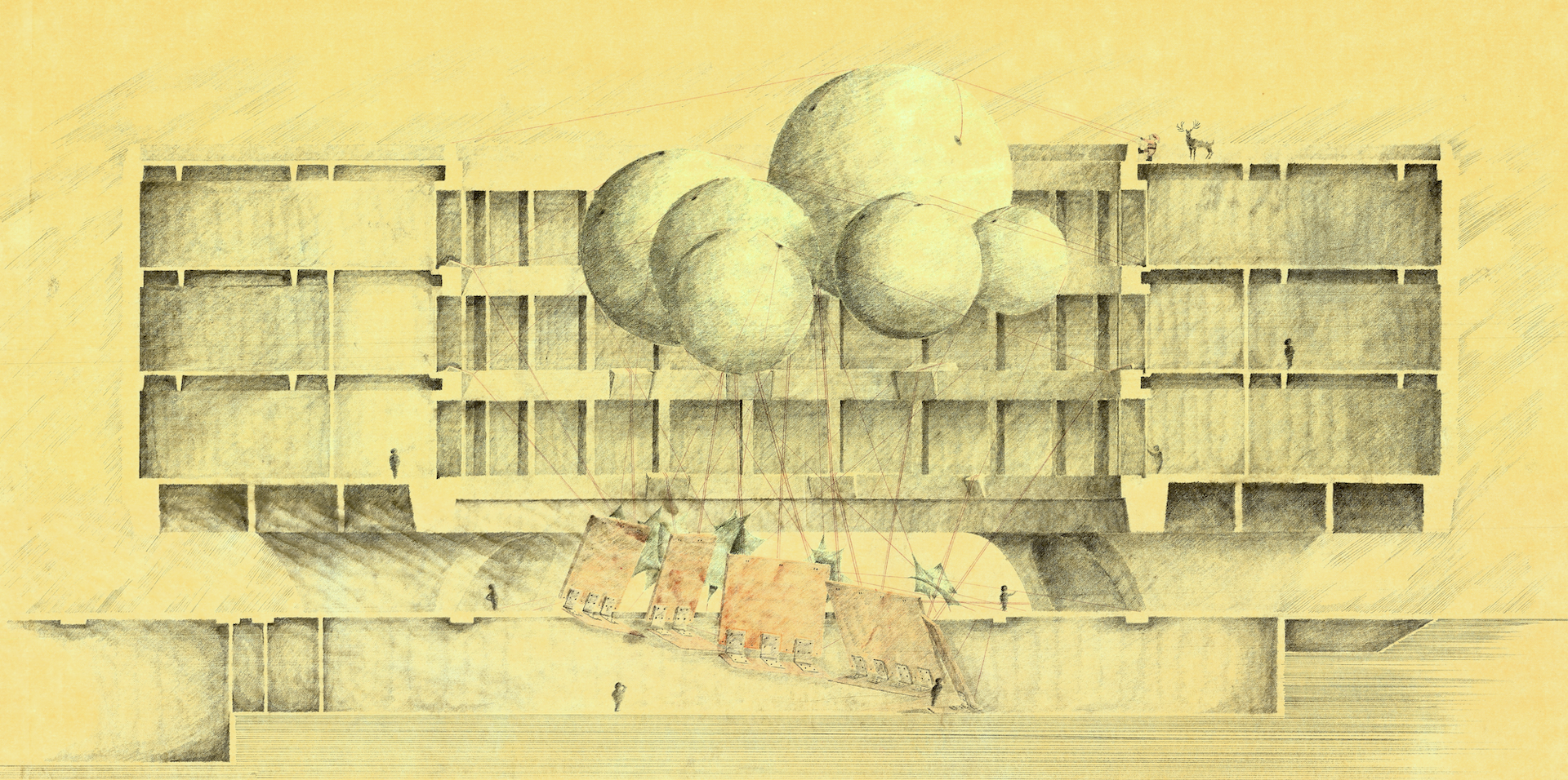
The section above was the centerpiece drawing of the presentation. This single drawing took me four days to make. The rendering is done in reverse style — I drew no lines to mark walls and floors, just left them white and rendered everything else. So whatever is white in the existing building is cut through.I rendered the section entirely in 9H graphite leads, which seems like an insane decision, but I did it for a reason. When you use softer leads, you can shade quicker, but you also lose your point very quickly, and there’s a noticeable difference in the stroke, which I wanted to avoid. It was an experiment which I probably wouldn’t do again, but I do tend to render with harder leads than normal, if not 9H exactly. (When I say four days, I mean four entire days, with just a few one-hour naps here and there. Probably close to 60 hours of actual working time.)
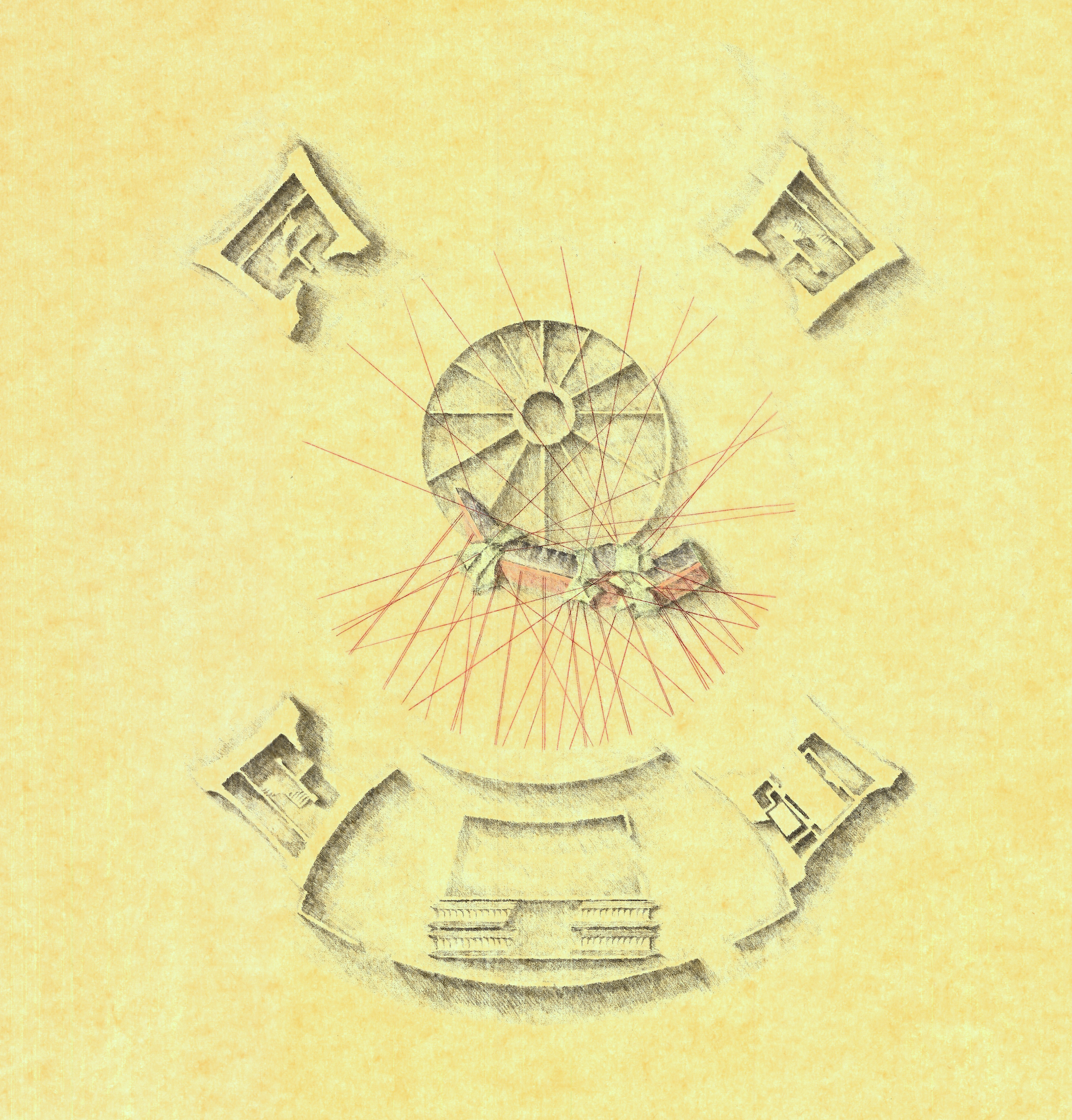
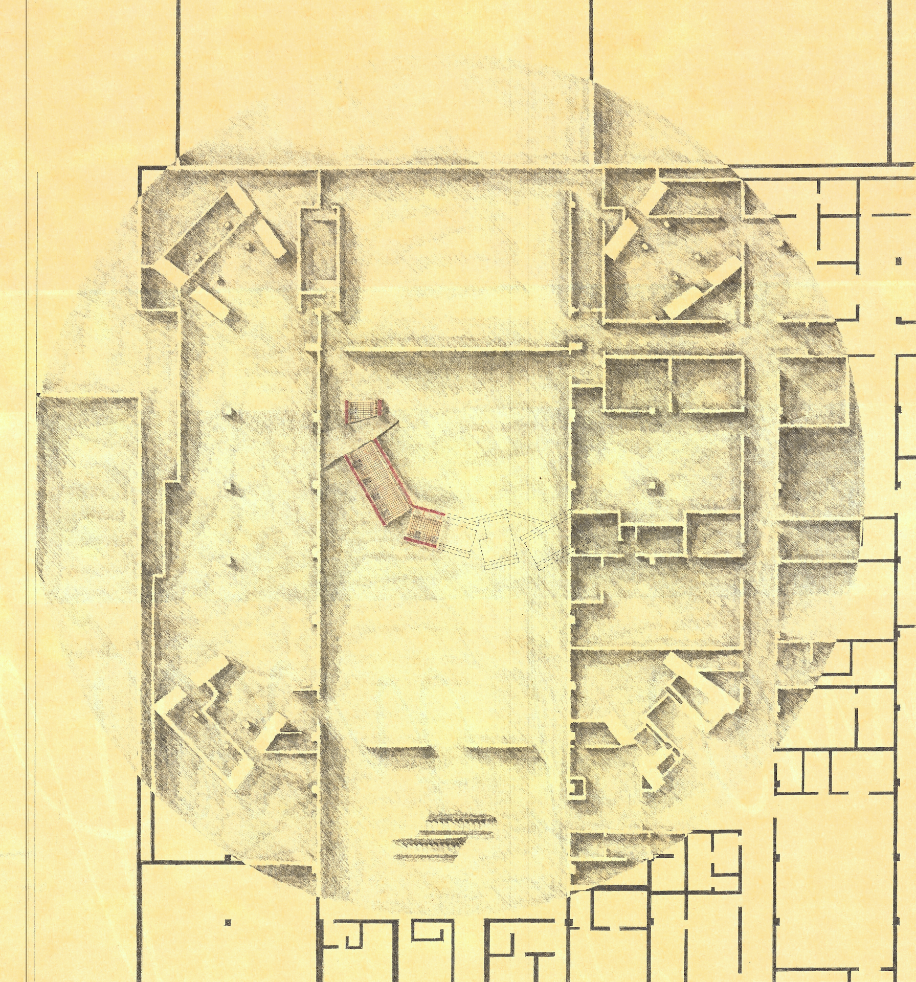
This was a very difficult yet rewarding project. Much of the difficulty came from approaching the design as a radical departure from traditional gallery design. Also the controversial theme… trying to express architecture as a reflection of two women, not necessarily to reflect on them as physical beings, but on how Picasso perceived them and how he felt with them, but most importantly how the style of his art manifested these feelings. The project is not a commentary on Picasso as a man or as a womanizer or objectifier of women (he arguably was), but I tried to see it as an architecture to display art that itself was a manifestation and extension of that art; a principle that could be applied to any art form or artist.
I felt that I was able to tap into some of this potential, thanks to the liberal critique of my teachers, who allowed me to see this as more of an intervention than an actual architecture. Work-wise, it was also a milestone for me, because up until this semester, I was never truly satisfied with my ability to complete a project, both in terms of design resolution and in creating drawings that were of a quality of presentation that I was happy to display.
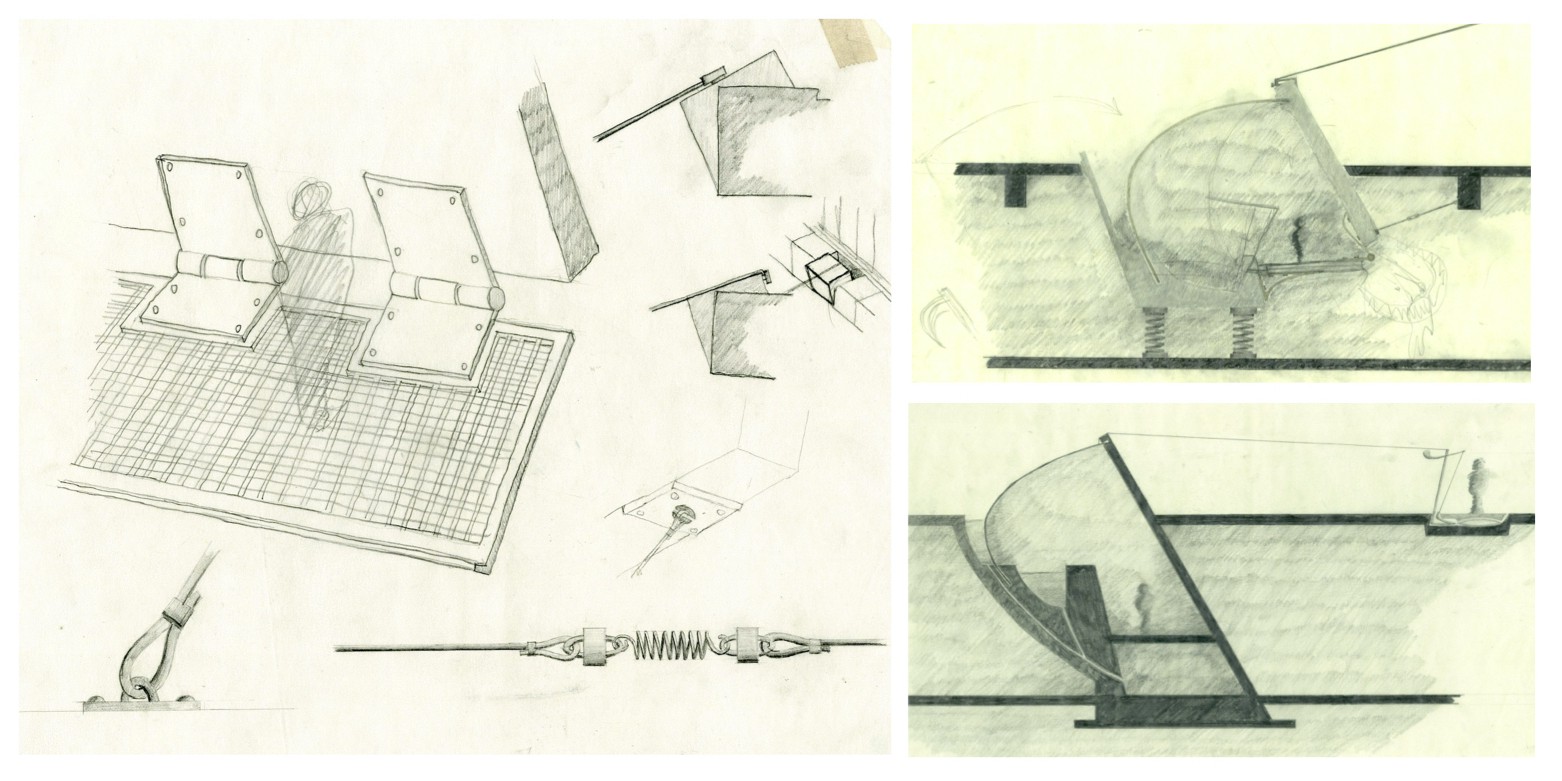
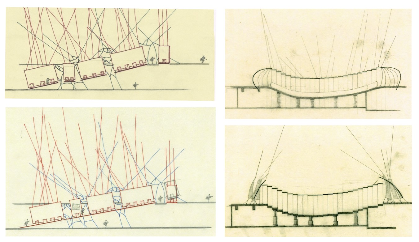
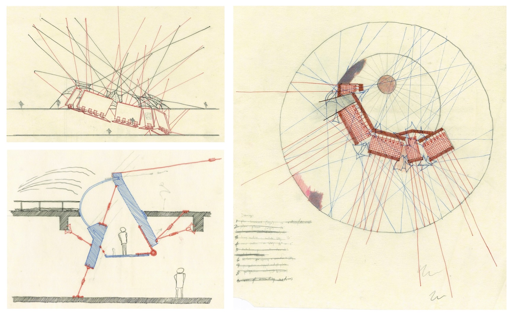
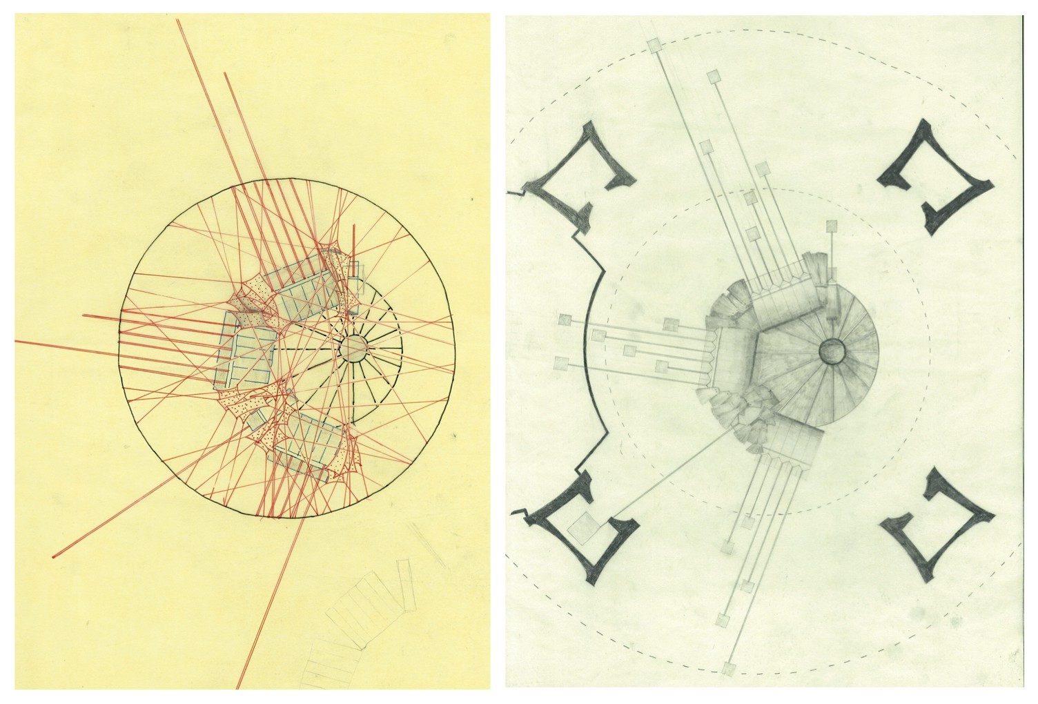

I tried to spend some time on how the second gallery would look — a series of balloons held aloft in the courtyard, with walkways going through and around them. You’d physically have to squeeze in between balloons to move around, a nod to feeling ‘smothered’ and womb-like. I eventually abandoned the idea of walkways and support columns, and just left the balloons as a ‘hint’ of what the second gallery might look like. The balloons also hold the lower gallery in place.
I worked extremely hard on this project, and I think the drawings show it, which is why I’ve uploaded many study and progress drawings to show how I got to the end. I’m fairly proud of the rigour and attention to detail that I put into this. Of course, I do wish I could’ve done even more, in particular to able to do the whole set of 5 galleries. I’m also proud of the quality of drawings, which I felt was at my highest point in my education thus far. I really tried to give myself enough time to make good drawings, and in fact, I told my professor (later my boss) that I was going to “stop designing” two weeks before the deadline, no matter how unresolved it was, so that for once I could have a decent presentation. He took that statement in his customary sardonic fashion. But I stuck to it, and I needed to. One of the final drawings took me four entire days to draw… just that one drawing. But I did finish my presentation on time, and spent much of the night before our project exhibition to set up the display exactly the way I wanted to, using a forest of cables tied to many fixed points in the exhibition space which held my drawings and model suspended in mid-air, and also making it near impossible (and uncomfortable, mind you) to get a good look at the drawings themselves. The Dean visited our exhibition and made a comment about how the display and the project content matched better than he’d seen any other project. (One of the rare moments that I felt pretty grateful to our Dean, to be honest.)
