a remembrance of trimlines past

Image for post
Photo courtesy of Night Flight (Facebook)

A few days ago, the image of this famously well-designed Trimline phone (designed and manufactured by Bell Telephone’s Western Electric division) came up on my social media feed. Instantly, like Proust’s beloved madeleine, it triggered a cascade of sensory memories from the time when this phone used to hang on the wall of almost every household in America. That was back in the late 70s and early 80s, which was a time of great transition for my family. That was when we moved from the city to the suburbs, into our own first house, with our own yard, and our own kitchen, on whose wall this phone had hung, from the time I was in 6th grade until long after I moved out for college.

I remember the smoothness of the moulded plastic and the exact weight of the handset in my hand. I remember the feeling when you were slotting the base into the wall backplate and it slid snugly into place. And the sharp click that the cord would make when you plugged it into the RJ11 modular jack. I remember the springiness of the lighted number buttons, and how I would push it down and try to find the exact moment when the light would go off, and then try it again, and again, with each number to see if it was the same for all of them. (It was.)

I remember pushing the acrylic hang-up lever on the base, while keeping the handset to my ear. I remember the exact amount of light-fingered pressure it took to push that lever down and disconnect the call. I pushed it down while listening so that I could find the exact moment when the dial tone would go silent, and to see if there was any tiny auditory transition between the dial tone and the absence of dial tone. (There was.)

I remember the additional hang-up button on the handset itself, just below the numbers. In the beginning, this was used to disconnect the call while you were far away from the base, and then begin another call. Later on, when technology and features had improved, pushing this button allowed you to switch between callers that you kept on hold. I also used to wonder why there were more holes in the mouthpiece than in the earpiece. And why the earpiece holes were arranged in a circle and the mouthpiece holes were arranged in a square. I still wonder. I’m sure some engineer can tell me. No one told me back then. (I never asked.)

I remember peeling the plastic display cover off with my fingernail so that I could take out the slip of paper underneath and write our home phone number on it in neat letters. I don’t know why we bothered to do that… we knew our home phone number better than we knew almost any other detail about our lives, aside from our names. I still know it. That was my parents’ number for 36 years even when we moved to a new house in the same town. I guess the number was there for guests, although I don’t know why a guest would need to look at our phone to know what our number was. All I know is that it was always my job to write the number on every new phone we got, because I had the best handwriting in the family, and to make sure the tabs on the thin plastic cover didn’t break when prying it off. (They never did.)

I also used to resent when I’d go to other people’s homes and they hadn’t bothered to write their number on the phone. Or even worse, when they wrote it sloppily, like when you start out with the numbers too big and then you run out of room, so the last few digits are too small to read, curling down in a weird spiral. I never made that mistake because even though I didn’t know it yet, I was a future architect, and I paid attention to things like that. But I don’t know why it bothered me when others didn’t do it. Maybe because they didn’t take their phone seriously enough; it was just a device to them, and probably a temporary one at that. People used to go through phones a lot back then for some reason. (Not us.)

I wonder if that was the real reason why we’d write our home number on the phone in the place where you were supposed to. Because it signified ownership, long-term ownership, serious ownership… of the phone and everything it meant to us. Once we wrote that number in that strip, the phone was now ours forever and all the myriad calls that came to us — the mundane calls about directions to people’s houses, or the more serious middle-of-the-night calls when someone overseas was calling to tell us that some important family member had just passed away. (We were always momentarily anxious when the phone rang in the middle of the night.)

I remember as well the cheaper knock-offs of this phone that weren’t made by Bell, but by some other lesser brand that you’d buy at CVS or Kmart. Those phones looked the same, but they didn’t in any way feel the same… they didn’t have the same weight or solidity, or the same springiness in the buttons, or the ringing sound it would make when you’d slam the phone down after an angry phone call. The Trimline phone (like all phones that were made by the telephone company) was built to survive the angriest phone conversations you could ever imagine. (And yes, I remember those too.)

I also remember the weight and tension of the spiral cord, and the constant effort it took to keep it untangled and not over-stretched. Over-stretched cords used to bother me; they ruined the perfection of the tensioned coil, hanging lightly and cleanly from the phone on the wall, and the utility of it staying compact when the phone was at rest. And untangling the cord always meant holding it by one end and letting the handset dangle and twirl around of its own gravitational will until the cord hung clean and straight, coiling back to its tensioned potential, waiting to be stretched out across the entire kitchen again, whenever my mom needed to talk and cook at the same time. (Why didn’t they ever put the phone connection near the kitchen counter and stove, I wonder.) And sometimes, when we knew this would happen a lot more — when we acknowledged our relative middle class prosperity by moving into larger and larger kitchens — we would subsequently splurge on longer and longer cords (six feet! twelve feet! fifteen feet!), allowing a working mother the freedom to multitask and socialize on the telephone while simultaneously preparing the family meal. (Which was every single day, of course.)

If you had to get a new cord (either because it was longer, or because it got over-stretched), I remember that it was tough to match the colour of the cord to the phone, unless we got it directly from the phone company, of course. I guess this is why we always had fairly non-exotic colours of telephones in our house… Dark brown is the one I remember the best and the one we had the longest, across multiple households and kitchens. We didn’t have the fancy olives and oranges and blues and reds like phones in the houses of my other American friends, my non-immigrant friends. We had a a dark brown phone, the same colour as our kitchen cabinets. The same colour as our sofa set. The same as our stained wooden doors and cedar shingles. And it was the same colour as us. We were our Trimline phone… brown and solid and plain and simple.

designing digital humanity

How designers make digital life more livable.

Image for post

Almost every weekend I travel by train on the Indian Railways network, so I tend to book a lot of tickets online. Over the last ten years that I’ve been doing this weekly travel, this online booking process has undoubtedly gotten better. A lot of unnecessary wastage of paper has reduced thanks to technological improvements and because the government recognizes that a simple photo ID is good enough to prove that you’re a valid passenger. You never even need an e-ticket anymore, let alone a paper one. Even the IRCTC website is much better than it used to be.

But there’s still one thing that bothers me about it, even more so because I’m a designer. Let me explain. When you go to cancel a booking online, you find the ticket you want to cancel, you select it, and you click the “CANCEL” button. So far so good, right? A pop-up message then comes onscreen that says something like “Are you sure you want to cancel this booking”? Beneath this are two options to click. One says “Cancel” and the other says “Yes”.

Do you see the problem here? Most people who have the word cancel on their brain, will click on the “cancel” button first, without thinking. But that just cancels the action, not the booking. It just goes back to the previous screen. If someone thought about this properly, the two options would say “No, take me back” and “Yes, cancel my booking”.

This is what designers do.

Designers take something which is meant to be simply functional and they make it more human. Designers observe how humans behave and think, and they design the world accordingly. And when designers are not involved in the process, then you can clearly see the gaps. Maybe the booking cancellation problem is just a small thing in the larger scheme of the world, but there are many big gaps too and we see them every day.

A huge number of people who watch television these days watch their shows on streaming services like Netflix or Amazon. It’s just easier and more convenient to watch entertainment at the time you decide to, not when someone else decides. But if the menus and screens which you use to navigate the vast collection of shows on Netflix was confusing to use, then very few people would be using it. Something like Netflix absolutely must be easy to navigate. You can bet a lot of money that they employ a large team of designers to make sure their interface works well. It has to look nice; it has to be easy to navigate; it has to prioritize what they think you want to see the most; it has to make sure new shows are prominently promoted. Sure, there are lots of technical people — engineers, software programmers, coders, etc. — who make that happen, but there are also designers to make sure that it’s all human. To make sure that I don’t get frustrated by the menus and decide to log off and choose something else instead.

Companies all over the world, and now especially in India, are putting lots and lots of emphasis on making sure their products and services not only function well but feel good, too. Tech companies that used to hire mostly IT graduates and business graduates, are now also hiring more design graduates because they know that if you want to succeed in a competitive marketplace, you have to make it an easier, convenient, and pleasant experience to use their products.

The more and more that our lives become tied to the online world, the more such efforts will be necessary. In the physical world, we demand good design. Although we surely don’t always get it, we’ve still become better at recognizing when something is designed well or not. We can recognize good architecture and interior spaces when we walk into them. When we cook, we can appreciate a well-balanced knife that fits nicely in our hand. When sit in a car, we can appreciate how well the seats conform to our body shapes. And when we interface with the digital domain — something we do almost every few seconds — we appreciate when the interface makes sense and when it does what we want it to do and takes us where we want to go.

Even my parents… who are getting into their 70s… and who utilize their smartphones’ potential far less than I do… can appreciate whether something on the screen is easy to figure out or not. My parents and my brother’s family live on the other side of the planet, and the fact that I can interact with them by video and chat any time of day, instantly, is a miracle indeed. As more and more Indians start to interact with each other this way, do we appreciate what it takes to make all of this technology work? To make it human? Do we appreciate what designers do?

I think we’re starting to. More importantly, I think young people all over India are realizing how they can be part of this trend and start to harness their creative talents to become designers themselves and make this new world a better one, a more human one. Every day when I come to the college where I teach, I see young designers doing their best to fit into this new creative-led economy. They work hard for sure, but they know the payoff is there because they see the impact of what they do every day, directly and immediately. They know they’ve made the right choice to follow a creative career because they see how their work translates into good design, good products, and a good environment for people.

(This article was published in the Deccan Chronicle, April 25, 2019.)

dialogue drives design

I clearly remember the moment when my personality changed forever.

I was always in introverted kid. An only child for fourteen years, and an awkward immigrant for many more, it’s no mystery why, with my shy and nerdy inclinations, I sought refuge in science fiction and fantasy books. They were my world. Too young to leave me home alone, my parents often took me along to their social engagements, a thousand-page book my only company and a safe haven from overzealous grownups asking condescending questions. I was nowhere near a natural conversationalist, and I shied away from engaging in, let alone starting, any dialogue.

Before you get all sobby and sorry for me (“Awww!”), I should make it clear that I did have friends. I did go out and play (although less often after moving to the suburbs). It’s not like I was a recluse. I was just the kind of kid that would prefer to stay in the background of conversations and listen, and this was a trait that continued mostly through college.

Now let’s fast forward to that moment I mentioned, when things changed. It was the summer of 1996, and I was starting my final year in architecture school. My first year tutor, Prof. Craig Konyk, asked me to be his teaching assistant in our college’s Educational Opportunity Program (EOP), which was a program to offer the opportunity of a quality education to a different type of student. My college, New Jersey Institute of Technology, was (and is) a well-known technical institution with the only accredited undergraduate architecture program in the state. NJIT has a diverse student body drawn from many working class and immigrant communities of Northern New Jersey. EOP accepted students who were just below the threshold for standard admission, but it required a one-month residential summer ‘boot camp’ before they joined the rest of their cohort. The idea was to prepare them for the rigor of college life before they started college itself. Not only was EOP successful in bringing more socioeconomic and cultural diversity to NJIT, it often prepared the students better than the rest of their classmates, and many EOP students ended up being the stars of their class.

Anyway, I was asked to be a Teaching Assistant and all TAs had to take a one-day training session by the EOP management. The training was kind of like an informal team-building and problem-solving session and in one of the first exercises, they put us into groups to solve some kind of hypothetical problem. My group of five or six people — most of us doing this for the first time — started the exercise sitting in a circle and just akwardly staring at each other. No one wanted to be the first one to talk. This, in a nutshell, was exactly how all such interactions in my life had been thus far — waiting for someone else to take the initiative in group discussions.

But this time, something was different. Something in me just snapped awake. I don’t know what triggered it. Perhaps it was the four prior years of having to present my work in architecture reviews. Perhaps it was my emerging self-confidence in being a good design student. But I think the biggest factor may have been that I was now 26 — a full-blown adult — and simply fed up of the awkward immature silence in group discussions where nobody says anything.

So I began a dialogue.

I took it upon myself to be the temporary leader of this misfit group, and started asking people how we’re going to solve this problem. I didn’t realize it at the time, but it was the moment that would change my life forever because it was the moment that started me off on two pathways:

First, I think it was that moment in which I started my teaching career, although I didn’t become an actual teacher until a decade later. It was then that I realized that true learning only happens when you open your voice and communicate with others.

Second, it was the moment where I really started to appreciate the value of dialogue in design. When I say ‘design’, I mean it in the broadest sense — design as a way to solve problems — an act of creativity and innovation. I had of course already been doing this in my prior four years of architecture school, but I didn’t fully realize the importance of dialogue until that moment. I realized that creativity only really starts to happen when you take out that… thing… that is bottled up inside and release it to the world.

Design education is built on a foundation of critique. The ability to properly give and take critique is very crucial to the progressive growth and practice of design. And critique happens best through dialogue.

In later years, I came to learn of the Socratic method, and the dialectic in Buddhist scholarship traditions, as well as the pedagogy of ancient education at places like Nalanda University. All of these traditions (and many others) point to dialogue and debate as a means to develop and inculcate critical thinking. This is well-established as a means of strengthening knowledge by exposing one’s existing knowledge to an array of contradictory or polemical thinking. This typically results in a more balanced stance, and being able to adapt one’s knowledge to external critique.

Image for post
Design moves forward only when there is dialogue between participants.

Design requires critical thinking in order to work. It requires the ability to understand and adapt to external stimuli and changing conditions. A design curriculum in an educational institution should not follow a specific code of rules or formulas; neither should it merely be a checklist of skills. Design requires debate. Designers are constantly tasked with defending their proposals against contrary thoughts and opinions, and almost always have to change their proposals in order to make them work better, or make them more feasible, or innovative.

This is one reason why design education, as compared to other traditional disciplines like science or commerce, is often slow to adapt to an increasingly digital context. This is despite the fact that, in the current world of constant connectivity, communication, and exposure to vast quantities of knowledge and ideas, most design debate still happens in person. To be sure, digital technologies and social media have exponentially increased the opportunity for dialogue between people of different cultures, geographies, languages, and contexts. A typical design student in 2018 has the benefit of truly vast quantities of information that were relatively unavailable to previous generations. And indeed, this has opened up design to extraordinary new avenues of thought and innovation, both simple and complex. Western designers can be inspired by a YouTube video that highlights a simple design solution to illuminate homes of the poor in the Philippines. Meanwhile, the same platform allows a college student in India to listen to a TEDTalk at UCLA on quantum computing.

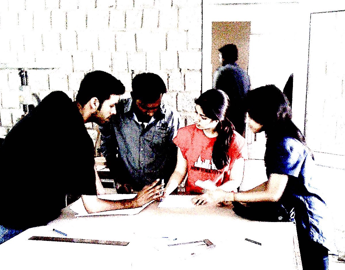
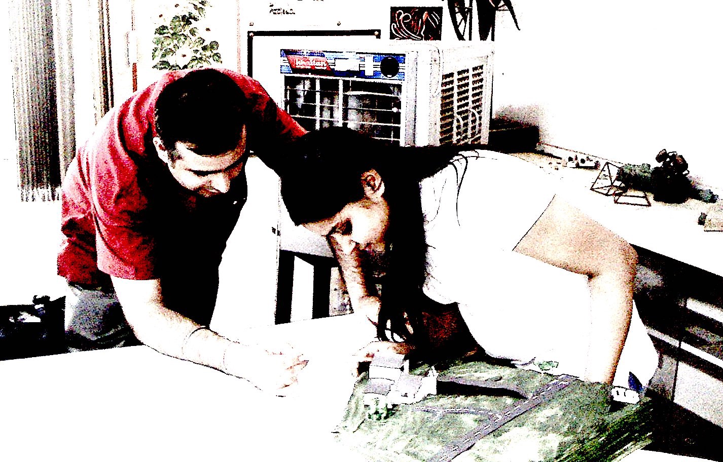
However, at its basic level, learning to become a designer still involves the simple dialogue that happens when two people sit at a table with drawings, sketches, models, prototypes and they simply discuss the problem at hand.

Image for post
The jury as a vehicle for dialogue.

The typical mode of feedback in design — the jury, or review, or pinup, and not an examination – is the primary means of assessing whether a design proposal works or not. Examinations, where a student provides a set answer to a set question and a typically faceless examiner in another room and place assesses whether that answer is correct or not, has little place in design education. In a design jury, a student presents his or her work, and a group of experts give their opinion on it, and usually provides suggestions on how to make it better. The group of experts don’t always agree with each other, and the students themselves don’t always agree with the feedback that is given. That’s all part of the dialogue of design critique, and it reflects how design works in practice as well. A designer is given a brief, works on a proposal, and shares it with the stakeholders (clients or users). They discuss, compromise, and sometimes argue and disagree, and they figure out how to go forward.

The result of this is that the student (and the professional designer) improves his or her design through dialogue, expands his or her knowledge, and goes through an iterative process that strengthens not only the quality of the design but the quality of the designer as well. The designer becomes more confident, more agile, and can better adapt to changing contexts. I might argue that indeed, this is the only way that a designer can become better. Good design requires validation for it to solve the problems it intends to solve, and dialogue can be the vehicle for that validation. Dialogue validates design. Dialogue drives design.

This not only facilitates a better designer, but a better person. A person who engages in dialogue shows that he or she does not have rigid ideas set in stone and is empathetic to the opinions and contexts of others. A person who engages in dialogue is often willing to take feedback, and to compromise and make adjustments to find real solutions. Thus, dialogue needs to be at the heart of any design endeavour, both in practice and in academia. (Fun fact: I believe this to such an extent that I named my own practice ‘DIALOG’.)

Image for post
Nothing beats sitting at the table and sharing ideas.

Many of my current colleagues and friends hesitate to believe this, but I’m still the same introverted kid that prefers to sit in the background with a book in hand and simply observe what’s happening. The difference is that I’ve learned to use the power of dialogue to try to improve myself and my situation. To try to improve my design. If I’m disconnected to a situation and have no interest in resolving it, then I revert to that inward-focused state. But when there’s a problem that needs to be solved, and I have a vested interest in its resolution (either as an academic or a professional designer), then there is no doubt that I will use what I learned that day in the EOP training session — I will voice my opinion, discuss it with others, and try to find a way to make it work. Sometimes I do it digitally [Thank you, Late-90s’ Internet Discussion Forums for that skill!] and sometimes I simply sit at a table with someone else and initiate a dialogue. Because dialogue drives design, and design solves problems. And there are still a lot of problems out there to solve.

(This article was originally published on Medium on 23 May 2018.)

designing better people

“That door is too small.”

In the spring of 1999, about a year after graduating from architecture school, I was invited by my former professor to be a jury member for the final year design project. Even though many of the reviews and juries during college were open, and students were always welcome to give feedback to their peers, this was my first time appearing on a jury as bona fide Design Professional. I was easily the youngest member of the jury, both in age and experience, and I really didn’t have much to say. All the other jurors were articulate and intelligent, and whenever they gave feedback to the students, I could only nod my head in agreement. I felt inadequate to the task, and didn’t feel I had much to offer. The extent of my meaningful contribution was the quote above —
“ That door is too small” — made in reference to one student’s project. Even when I said it, and elaborated on it, I knew immediately I was just trying to say something to make it seem that I belonged there. I could tell that everyone else could see right through this charade and knew quite well what an amateur I was. It was humbling.

Image for post
Not my first time around the block. (Photo credit: Moulshri Joshi.)

In the nearly twenty years since that day, I’ve appeared on many, many architecture and design juries. I’ve since become a professor and administrator in my own right, and not only do I appear on juries, I give students and faculty advice on how to conduct them, and how to give the best feedback possible without humiliating or demotivating the student. Despite the years of experience however, I still feel inadequate to the task and quite often, still unsure whether people are taking me seriously. But it doesn’t stop me from trying. I keep trying to become a better teacher, a better designer, a better boss, and a better person.

One thing that has crystallized in my thinking as a design educator (even if the means to do so has not) is that design education must be about about the person. I’m not just talking about the student person, but about all those persons that exist within the student’s circle of influence — the teacher, the administrator, the family member, as well as the student’s potential employer, colleague, client, and user. When one works on making the student a better person, one naturally impacts the people within that circle and one has the potential to make them better as well (not to mention being able to make one’s self better too).

I’ve studied and taught through many design curricula in which the goal was to achieve a certain prescribed graduate profile — a candidate for entry into the noble profession of design. Despite the fact that no two design professionals will ever agree on what exactly that profile should be, many educators and institutions feel that they have an idea and thus go about trying to create a curriculum that builds a student up into that fixed profile, piece by piece, until the student has become the paragon of what that profile entails. An Architect. A Graphic Designer. A Product Designer. But those capital letters don’t really exist. Some governments and professional bodies, for example, have a precise legal definition of what an Architect is, but I’ve never seen two architects who do the same thing, or in the same way. Even more so for designers, who mostly don’t have such regulatory constraints.

So… what should we be training our students to become? Again, the answer is broader… focus on making the student a better person. The hot molten core of a good designer will always be a good person. Compassionate, thoughtful, curious, agile, independent, driven, well-read, aware, eager, motivated, rational, irrational, organized… you can keep adding adjectives if you want; you get the point.

The thrust of a good design education should be to help the student become a better person, a better member in the society to which he or she belongs — an obverver of its contexts, a contributor to its change, a mirror of its past, present, and future, and a commentator of its culture. The rest is (relatively) easy… skills, knowledge, information, proficiencies… these things can be accumulated alongside the main objective, but should not be the main objective.

In future writings, I hope to expand on this and discuss with other educators, designers, and students on how this actually can be accomplished. I’ll try to relate the idea of dialogue as the driver of design, as well as open curriculum, the attempt to be student-centric, promoting innovation, non-academic pursuits, the global perspective, industry expectations, and other things. I’m not sure I myself fully know how this can be done…but I know that I and a lot of my colleagues and fellow educators are trying to figure it out. Hopefully we can share those thoughts and experiences and move in the right direction.

And move the conversation beyond how big the door should be.

(This article was originally published on Medium on 22 April 2018.)

best laid plans

I started this blog in 2013 as a way to document a six-week road trip across the United States. By the time I got to Pittsburgh (three days into it) I was already tired of blogging. There was too much pressure every day to write and post pictures about my travels. So I stopped blogging and used Facebook instead, which worked out much better. More people got to follow the trip and it was easier to upload photos and descriptions.

And then I ignored this site for seven years. And to quote everyone’s favourite hobbit Sam Gamgee: “Well, I’m back.”

Lots of things have changed both in my own life and the world around us. Even as I write this, we’re in the middle of one of the most significant (and bizarre) events in history – a worldwide global lockdown due the COVID-19 pandemic. So let’s see how blogging in the ‘new normal’ goes. This time I intend to write more generally – articles about topics of personal and professional interest, like architecture, design, cities, art, and education. I may also throw in my thoughts about media I like – books, movies, television, and so on.

The first thing you’ll see over the next few days is a migration of a bunch of stuff I’ve written in the past year or so from Medium.com, a site that I now find to be slightly better than useless in terms of getting people to discover and read what I write. After that, I hope to write more frequently, formal as well as informal stuff. So watch this space. And if what I say sparks any thoughts, do me a favour and post your comment. I like to think of writing as dialogue – thoughts and ideas improve when they’re discussed, debated, and revised. If I wanted “likes” I would just keep writing on Facebook. So if you have a response to what I say – a comment, a question, a critique – then let me know right here where I can see it.

Oh, one more thing. Back when I started this in 2013, the blog was called “long division”. Don’t ask why. I’m not even sure I remember exactly. I changed the name to palimpsest, which is one of my favourite concepts in design and abstract thinking. Technically the world palimpsest refers to a phenomenon that occurred before the printing press was invented, when scribes used to write manuscripts on parchment paper. Since the parchment was expensive (usually made from animal hides), when they wanted to write new pages, they would scrape off the original writing as best as they could and write new text over it. Over multiple instances of this, one could see several faint layers of the old text beneath the new, forming a sort of abstract pattern of lines that no longer looked like written language.

Palimpsest - Wikipedia
The Codex Ephraemi Rescriptus, a Greek manuscript of the Bible from the 5th century, is a palimpsest. (Source: Public domain, wikipedia.com)

This idea of layers of information added continually on top of each other fascinates me. The word is now used abstractly to describe any kind of layering of elements where the previous layers can still be discerned. One sees this in cities and settlements, in architecture and habitation, in objects and images. If you look deeply at anything, there is a palimpsest there that enriches and illuminates the entire history of the thing being observed. The term also refers to the idea of repurposing and reusing something, which, aside from being a generally good way to approach an otherwise wasteful world, is a fitting reason to use it as the name of this site – a digital space that was initially meant to do something else entirely. That’s why I’ve decided to keep my old posts from the original blog. There’s only four of them, and nothing’s wrong with them. You might even like reading them.

Hopefully as this space fills with new thoughts, new ideas, and new information, it will add to and enrich the palimpsest of thoughts we encounter every day.